Lilis character design isn't for everyone, and I mean pretty much all fighting game characters are a walking trope. XD Lili definetly adds diversity since her style and presentation is one of the most unique in tekken, she uses dance and ballet to fight and appearance is iconic. Also all those girls you used as examples except for Karin are hideous XD I like lili because she represents freedom and rebellion which is why I miss her old third costume in T6, it's one of the most beautiful costumes I've seen in any fighting game, especially the long lace veil and chains, I still feel like to this day it should've been her default post T6
You are using an out of date browser. It may not display this or other websites correctly.
You should upgrade or use an alternative browser.
You should upgrade or use an alternative browser.
The Art Style and Graphics Discussion
- Thread starter Tyaren
- Start date
Lilis character design isn't for everyone, and I mean pretty much all fighting game characters are a walking trope. XD Lili definetly adds diversity since her style and presentation is one of the most unique in tekken, she uses dance and ballet to fight and appearance is iconic. Also all those girls you used as examples except for Karin are hideous XD I like lili because she represents freedom and rebellion...

...which is why I miss her old third costume in T6, it's one of the most beautiful costumes I've seen in any fighting game, especially the long lace veil and chains, I still feel like to this day it should've been her default post T6
You mean this..."beauty"?

Jadeinchains
Well-Known Member
...The only thing applicable to that outfit is that time I said "when your weddings at 6 but your next hooking shift is at 7".
It's nice that you like that outfit Kasumi but just personally I think it looks like a mess.
It's nice that you like that outfit Kasumi but just personally I think it looks like a mess.
Yeah, except it's not extracted and looks much better in game with all the shaders and physics in effect and isn't just an extract on deviantart XD and I can see your difference in opinion, but she still is one of the most popular characters in the game and she's relatively a recent addition which I think says alot.
You mean this..."beauty"?

Also I'm blown since apparently Street Fighter 5 isn't here today...
Also I'm blown since apparently Street Fighter 5 isn't here today...
You are by the way aware of the many gigs of data that you will have to download when it arrives? The game released half finished after all and was patch updated like a hundred times. But I guess you now have an Internet flat and you can download as much as you want?
No but I do have xfinity wifi which gives a free trial hour long access per email address used so I'll be able to download the patches and gigs within that time and I'll just use my own 4G for the remainder if it stops midway, so I'm prepared which makes me happy. And my mom has her wifi from her phone so I can ask for her passcode if I need toYou are by the way aware of the many gigs of data that you will have to download when it arrives? The game released half finished after all and was patch updated like a hundred times. But I guess you now have an Internet flat and you can download as much as you want?
Before the inevitable happens and we will be flooded by SFV goodness, let's again take a look at a game that was actually barely mentioned in here (only by myself a couple of times), but which imo was absolutely beautiful and true piece of art, The Last Guardian:


The massive, beautifully lit environments and of course Trico, who in 15-20 hours not once fails to act like a real, living creature, are imo one of the PS4's greatest technical achievements.


The massive, beautifully lit environments and of course Trico, who in 15-20 hours not once fails to act like a real, living creature, are imo one of the PS4's greatest technical achievements.
Jadeinchains
Well-Known Member
It looks great! Also It's not long to go lol. Soon the great Kasumi flood of SFV pictures will arrive. 
Trico looks adorable. It's little demon horns and giant ears lol. XD
Trico looks adorable. It's little demon horns and giant ears lol. XD
Trico looks adorable. It's little demon horns and giant ears lol. XD
He is, you will love him too.


You will also sometimes want to murder him (when he just does what he wants)...but then you will love him again. :3
Jadeinchains
Well-Known Member
Lol I recently got a new cat and I feel that way towards of getting angry with but then 5 seconds later loving again so I can imagine how I'd feel towards Trico.  I love how it's actually like those eyes that glow when the light hits them.
I love how it's actually like those eyes that glow when the light hits them.
Lol, that's actually a little creepy sometimes. When he knows you have something edible his eyes are glowing brightly.

Chapstick
Well-Known Member
I have a black cat so a lot of times when it's dark this is all I see looking at me from the shadows lol, really nice realistic touchLol, that's actually a little creepy sometimes. When he knows you have something edible his eyes are glowing brightly.

Jadeinchains
Well-Known Member
I have a black cat so a lot of times when it's dark this is all I see looking at me from the shadows lol, really nice realistic touch
Lol I was gonna say the same thing, She's completely black so when she was hiding earlier and I was looking for her I looked under the bed and just saw her looking back at me from in the dark cause her eye's were reflecting the light!
And that looks cute in that image Tyaren lol.
Jadeinchains
Well-Known Member
I kinda thought that too, it's not bad but it's not exactly easy on the eyes either. The face for that one guy looks washed out and I had to click on the pic to make out his eyes and mouth more clearly

Says the fan of Tekken 7's visuals. No tea no shade no pink lemonade.
I don't know I find it looks really cute with the giant what ever Trico is. It has like a dark atmosphere like SOTC with it being very dark colours.
The Last Guardian is actually quite ugly, IMO. It hurts my eyes to look at. I think it has something to do with the way the lighting is set-up. Everything is too washed and shiny, much like Ubisoft games.
Can't generally agree. :/
By too shiny do you mean the heavy use of bloom lighting? With that I do agree, it is taxing on the eyes:


I think it is there for one, because they wanted to have a great contrast of the dark, gloomy and cold depths of the labyrinth to the sun-drenched, warm outside, that you occasionally step out into and which is where you eventually want to escape to.
Secondly, I think Fumito Ueda, the games director and designer, can generally not have enough bloom. It's also heavily used in Shadow of the Colossus. That effect was really in on early PS3 and Xbox360 games. The Last Guardian is kind of a PS3 game that missed the train, lol.
I kinda thought that too, it's not bad but it's not exactly easy on the eyes either. The face for that one guy looks washed out and I had to click on the pic to make out his eyes and mouth more clearly
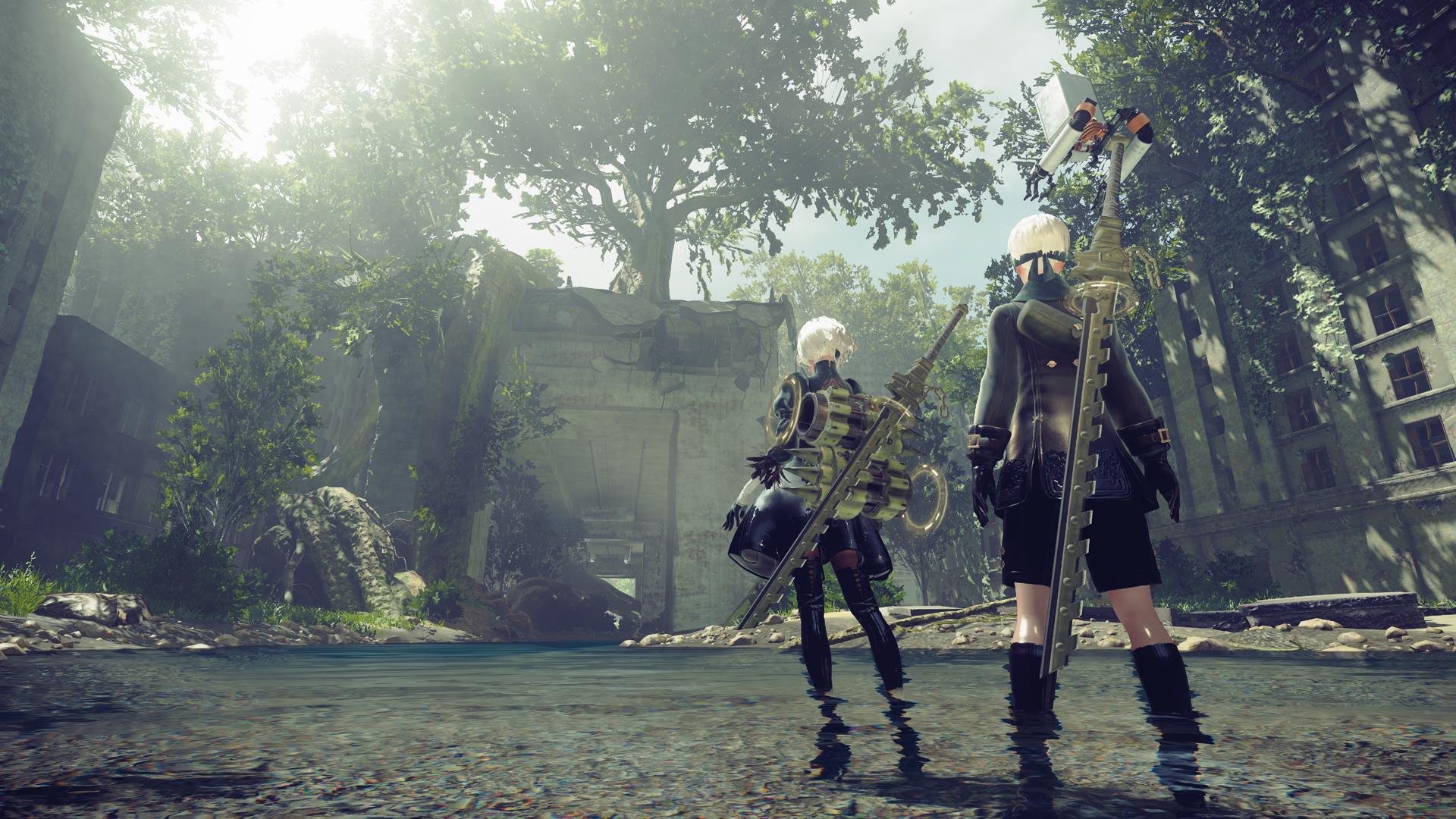
I knew you would want to jump on that wagon immediately. Funny thing is though, that your favorite Nier Automata has a very similar look and use of lighting actually:


And don't get me started on how blurry and unrecognizable Tekken 7 is on PS4.
Last edited:
Jadeinchains
Well-Known Member
Do you own the game? XD and I can see the faces clearer in tekken 7
View attachment 23593
The environments in the game still look good tho, it seems they sacrifice character model detail for the environments from what I see
Get out of here Khia lol! XD And the character looks like that because they seemed to be going for a difference between Trico's realistic looks ( I mean in how detailed he is ) versus the human character being more cel shaded.
Yes, but it's a particular type of bloom abuse.Can't generally agree. :/
By too shiny do you mean the heavy use of bloom lighting?
The "dark" areas are still so bright they look like full-brighted mid-range gray textures only to "contrast" with the same shit plus absurd levels of bloom. They're "contrasting" "bright" with "even brighter." It's dumb.I think it is there for one, because they wanted to have a great contrast of the dark, gloomy and cold depths of the labyrinth to the sun-drenched, warm outside, that you occasionally step out into and which is where you eventually want to escape to.
There are a few directors/devs that have an obnoxious bloom fetish. The Fable games were always terrible with it, Ubisoft is generally pretty terrible, Bandai Namco (SC/Tekken) have a different kind of bloom-abuse (that's also terrible), and some others. All are hideous without exception.Secondly, I think Fumito Ueda, the games director and designer, can generally not have enough bloom. It's also heavily used in Shadow of the Colossus. That effect was really in on early PS3 and Xbox360 games. The Last Guardian is kind of a PS3 game that missed the train, lol.
Which is one of the principle reasons I said that it looks like ass.I knew you would want to jump on that wagon immediately. Funny thing is though, that your favorite Nier Automata has a very similar look and use of lighting actually:
