UpSideDownGRUNT
Well-Known Member
Epic aren't making this game, Microsoft's in-house Gears team The Coalition is.

Epic aren't making this game, Microsoft's in-house Gears team The Coalition is.
It looks great. I've never really been a fan of its gameplay though. A lot of crouching behind conveniently placed waist high walls in those games.
Y'all are wild I have a picture of jellyfish as my wallpaper
") (Who would've thought, right? XD)
(Who would've thought, right? XD)I do use an edited screenshot I took of dangerzone for my phoneAnd I usually have pretty game photos that I did and that I am proud of as my desktop background.
These were the ones that I had in the last 4-5 months. The last one being the most recent:
View attachment 20470
View attachment 20468
View attachment 20467
View attachment 20471
View attachment 20469
I prefer darker ones where the app icons stick out more.


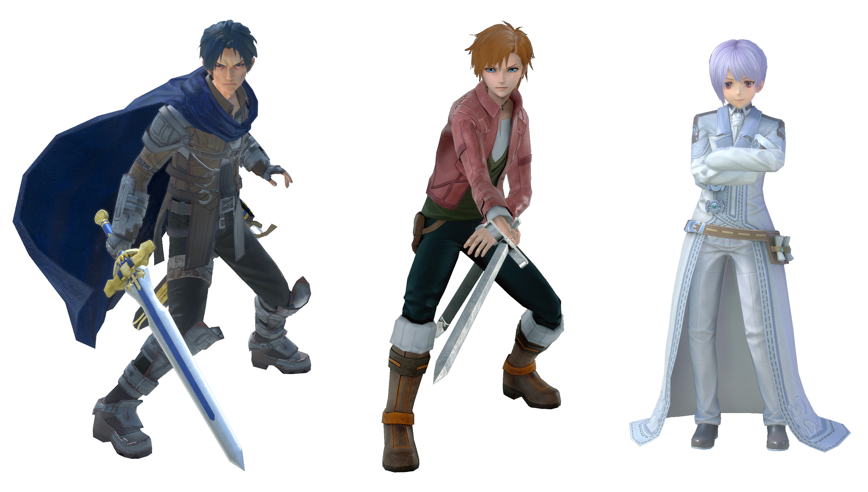
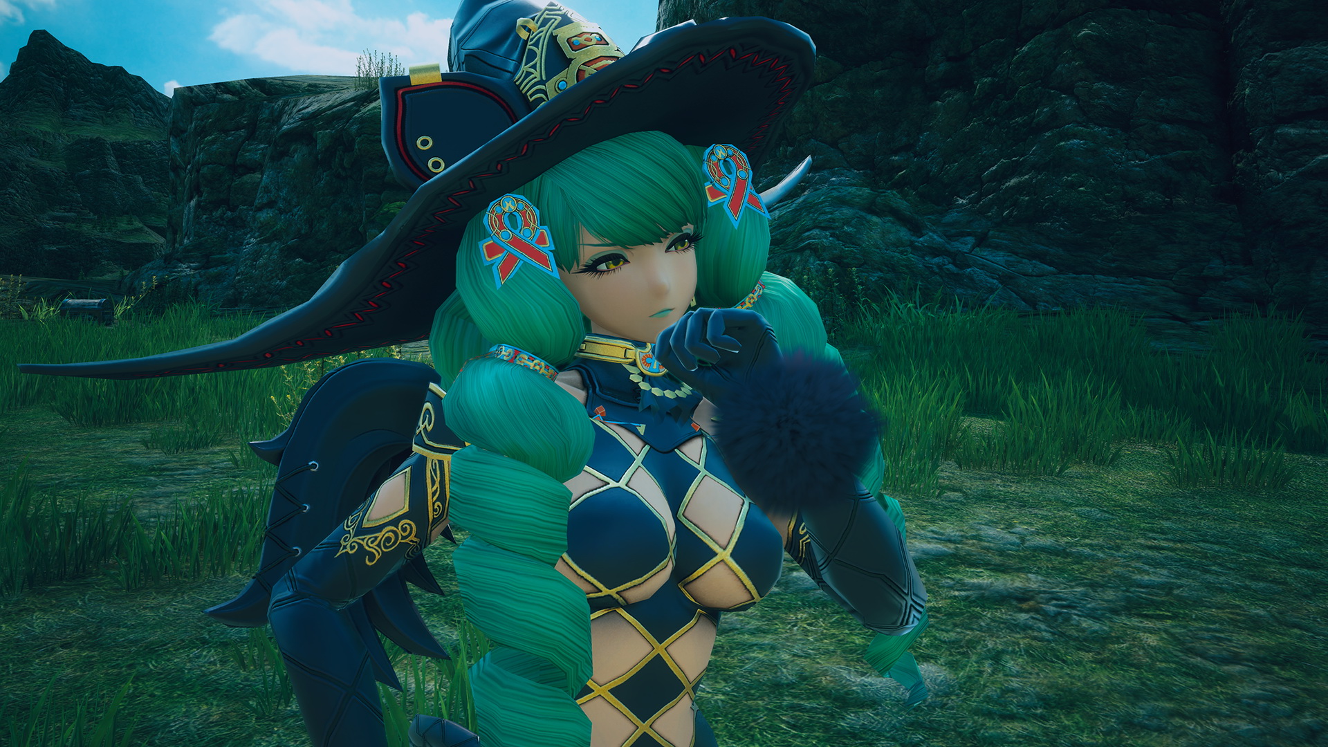
why does Star Ocean 5 look worse than Star Ocean 4?
You know what she looks like?
why does Star Ocean 5 look worse than Star Ocean 4?
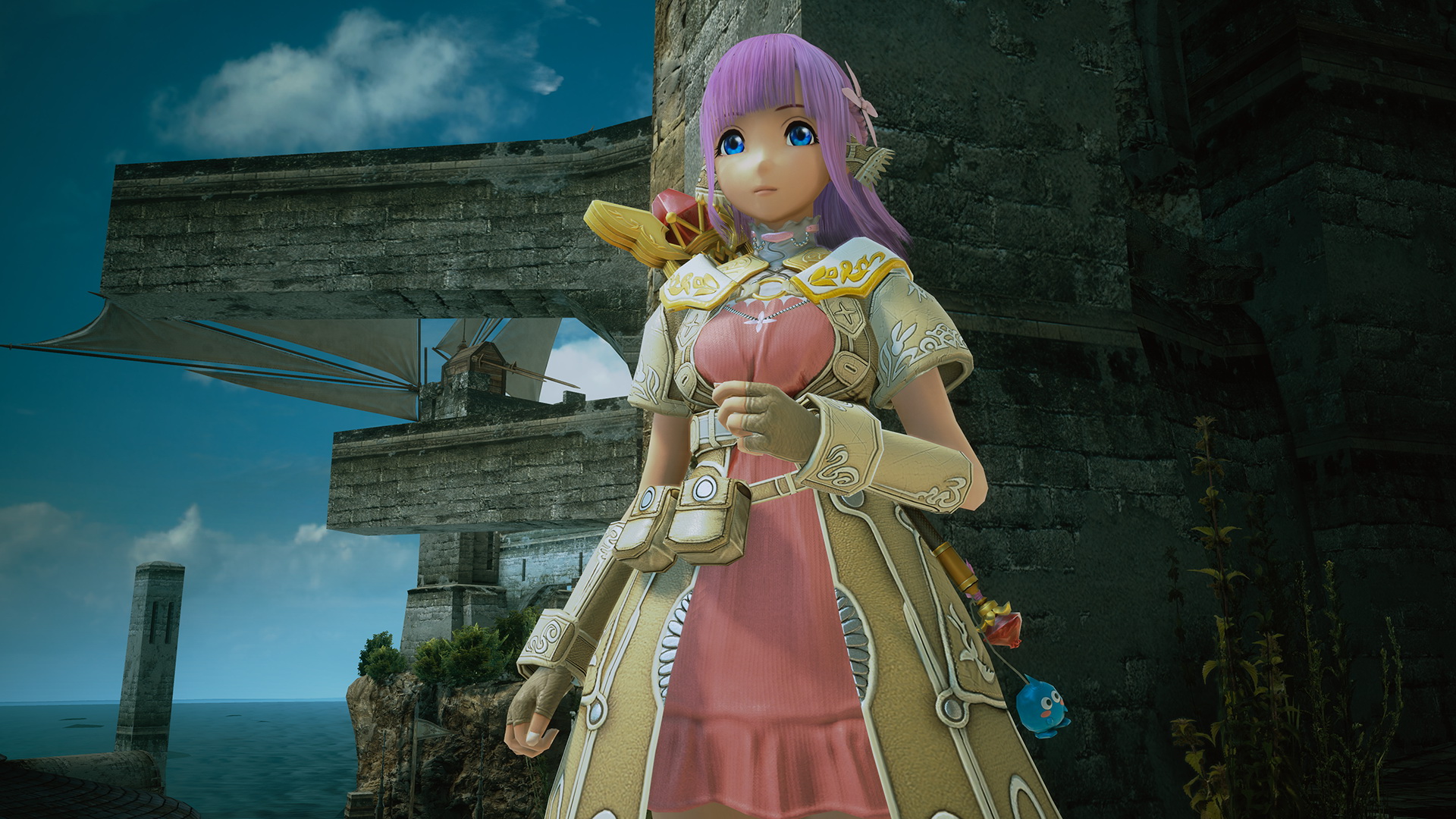
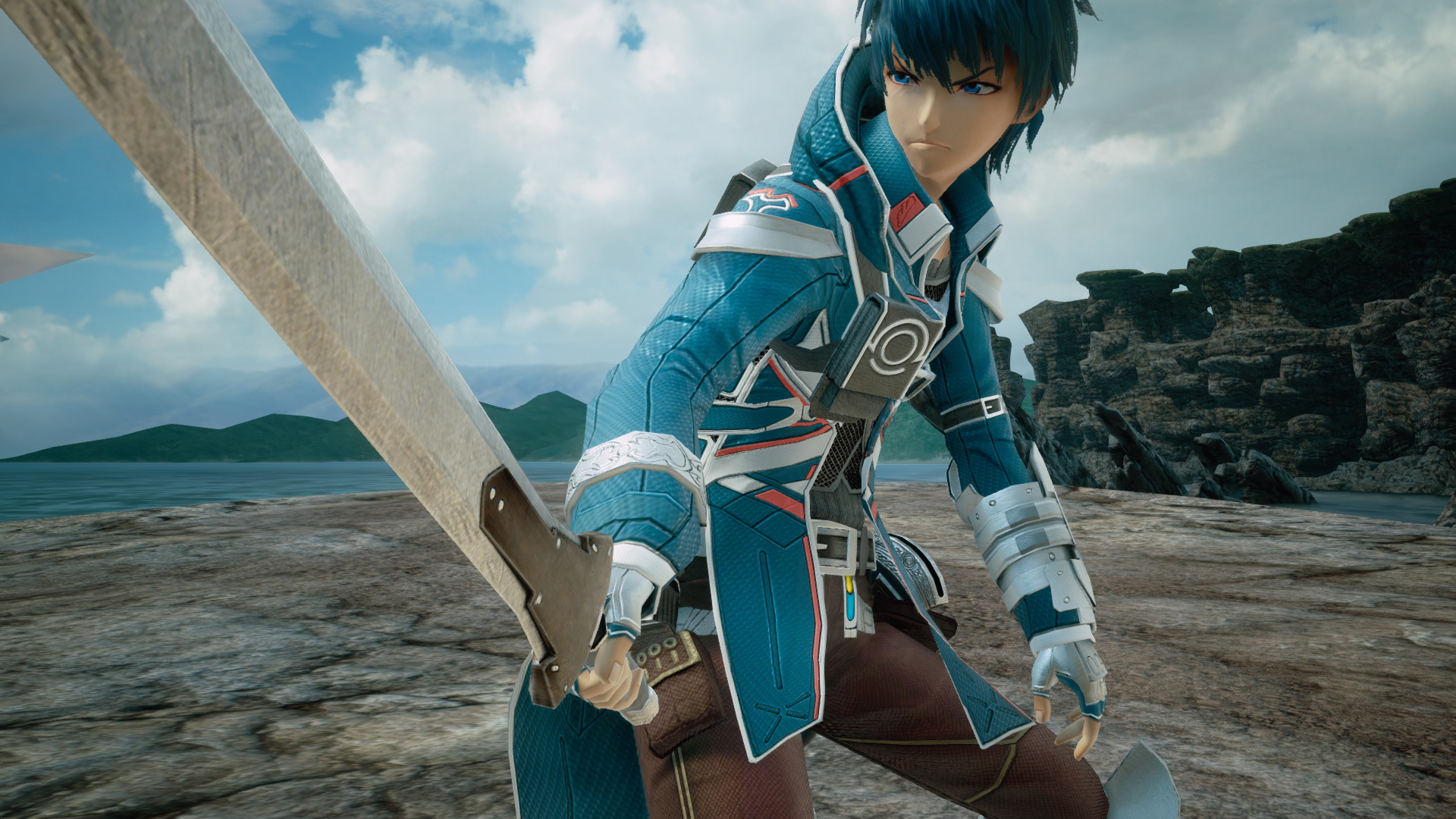


@Tyaren poly count aren't the only factor in how things look, remember? You can get away with low poly count with good texture work/appropriate art style. These actually make for a consistent art style and it comes across more as a clean visual aesthetic like dragon quest heroes or blue dragon, rather then simply bland and featureless mannequins like KOF XIV


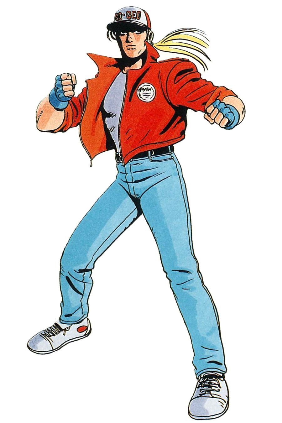


I'm temporarily stopping by this topic (it's not worth scrolling past the 84 huge-ass pictures per page all the time [wtf this is what spoiler tags are for]) to mention that Terry's KOF14 look appears to be a throwback to his original appearance in Fatal Fury 1.
FF1
KOF 14
His sleeveless look came later, "iconic" as it may be.
Now you are basically repeating what I told you from the very first time on when you called KoF models PS2 quality models.
My point here also was not that SO5 models looked bad and that this was due to their low polygon count, I just pointed out that these models are close to PS2-quality character modelling that you apparently saw in in KoF14. If I would guess the SO5 models are made up of no more than 10k polygons. The KoF character models are probably made of at least 80k. Street Fighter 5's character models are for example way blockier and less detailed than KoF14 models and I know for a fact that they are made up of about 60-80k polygons:
Here's "Hot Ryu" in triangels/polygons:
Anyway, talking about anime/comic art styles, how do you guys like the look of the new Ratchet & Clank remake for the PS4? These new screens were just recently released:
Over on Gamersyde you can watch new uncompressed HD gameplay of the game. Direct links to each of the videos:
http://www.gamersyde.com/hqstream_ratchet_clank_novallis_gameplay-36856_en.html
http://www.gamersyde.com/hqstream_ratchet_clank_aridia_gameplay-36855_en.html
http://www.gamersyde.com/hqstream_ratchet_clank_kerwan_gameplay-36857_en.html
Looks pretty, huh?
That last picture of the game stands out to me as the best. I love games with cartoony art styles with amazing graphics that make all the vibrant colours pop. Not to mention the contrast of the cartoons art style with the realistic shading.
It all looks so smooth and fluid. The last jump 'n' run that I bought was Super Mario Galaxy many years ago, lol, but this game makes me consider if I shouldn't give another jump 'n' run a try:I don't think you did. You can't fool me. lolI think we all knew that about Terry's design.
I mean, after a certain size, the site itself puts a limiter on it where you have to click to make it larger. But, even so, having so many pictures causes the page to jump around all over the place when you arrive on it because all the pictures are popping into the page as they load (like it did when I came back here to reply to this). Even for smaller pictures like mine. Spoiler tags help with that because you're the one consciously choosing to grow the page.But I do agree we (or rather I XD) should limit the image overload per page a little. The last thing I want is turning away people because of this, when I'm always happy a lively discussion takes off in this thread at all. Let's limit the "huge-ass" pictures outside of spoiler tags to 5 per post as a beginning.
As tiny pictures as werewolf's imho don't really need to be in a spoiler though.