@Argentus, don't worry I will still be posting here, I just won't get into the long winded kind of explanation and discussion anymore. I also didn't make this decision because I was upset about especially your comments.  One last thing though, just because it took you so much time and effort to make a case with your last post:
I think you dislike many of the KoF12/13 sprites for highly subjective reasons. There really is nothing wrong with the majority of examples you posted other than they aren't to your personal liking as a gamer, not designer, and you do have some very specific preferences on top of that. That's what I learned in the time that I've come to know you better. Especially with your women.
Exaggerated declarations like KOF12/13 sprites look "fucking hideous" and KOF14 character models look like "PS2 models" clearly show you are not being very objective or moderate in this regard.
I do also not like certain choices in character design but I am aware that I don't like them for very subjective reasons. Let me think of one...
I don't like that DOA5's Brad isn't devilishly handsome like in DOA4 anymore. And I complained about that in the past. But I get what they were going for now. They made him a more realistic character, showed his age and what alcohol abuse did to him. That certainly does take a toll on your looks after years of abuse...
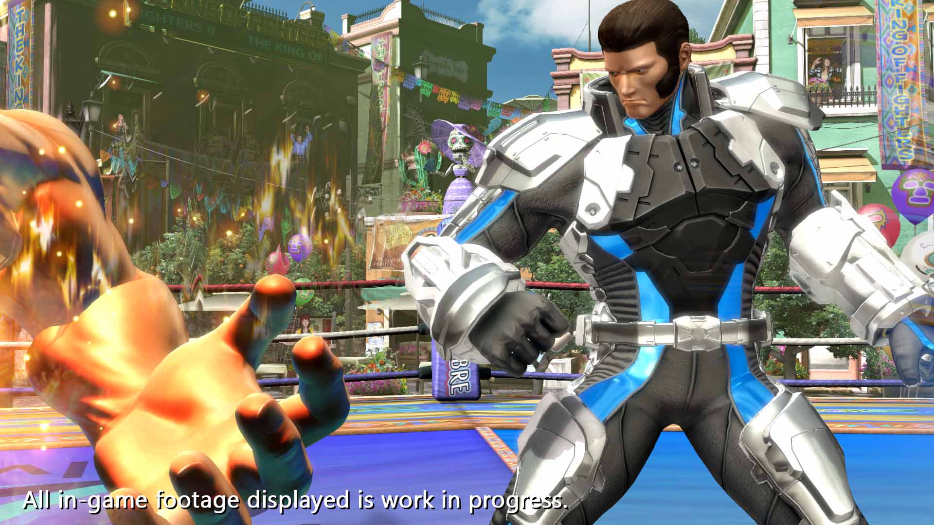
I really do see your point with Ralph and Clark, they are extremely overdrawn to a point they resemble Hulk, maybe even worse. But if Terry and Kyo already look so overly muscular and broad these two had to be thrice as big I guess. It's just coherence...
The most I agree with you on Knuckles actually. He should be all about his name giving knuckles... Now it's more about his overall strength and he looks more like a dumb muscle head. Which he really isn't as far as I know. But even here I also see a very good reason for altering his design like this. It brings more variation and individualization to the characters' physiques. Old Knuckles looked exactly like Sonic body proportion-wise, he was just colored red. (That's lame character design. Even Luigi looks different to Mario, not just in color!) His actual abilities are supposed to be very different from Sonic though. Why were his limbs still so thin and his feet so prominent? Now he looks much more unique within the sonic game world and like someone who really is the strongest out of the group of main protagonists. And look, I just figured this out myself but according to the Sonic Wikia, which I took a look at just now, the designers actually thought the exact same. Almost scary:
http://sonic.wikia.com/wiki/Knuckles_the_Echidna_(Sonic_Boom)
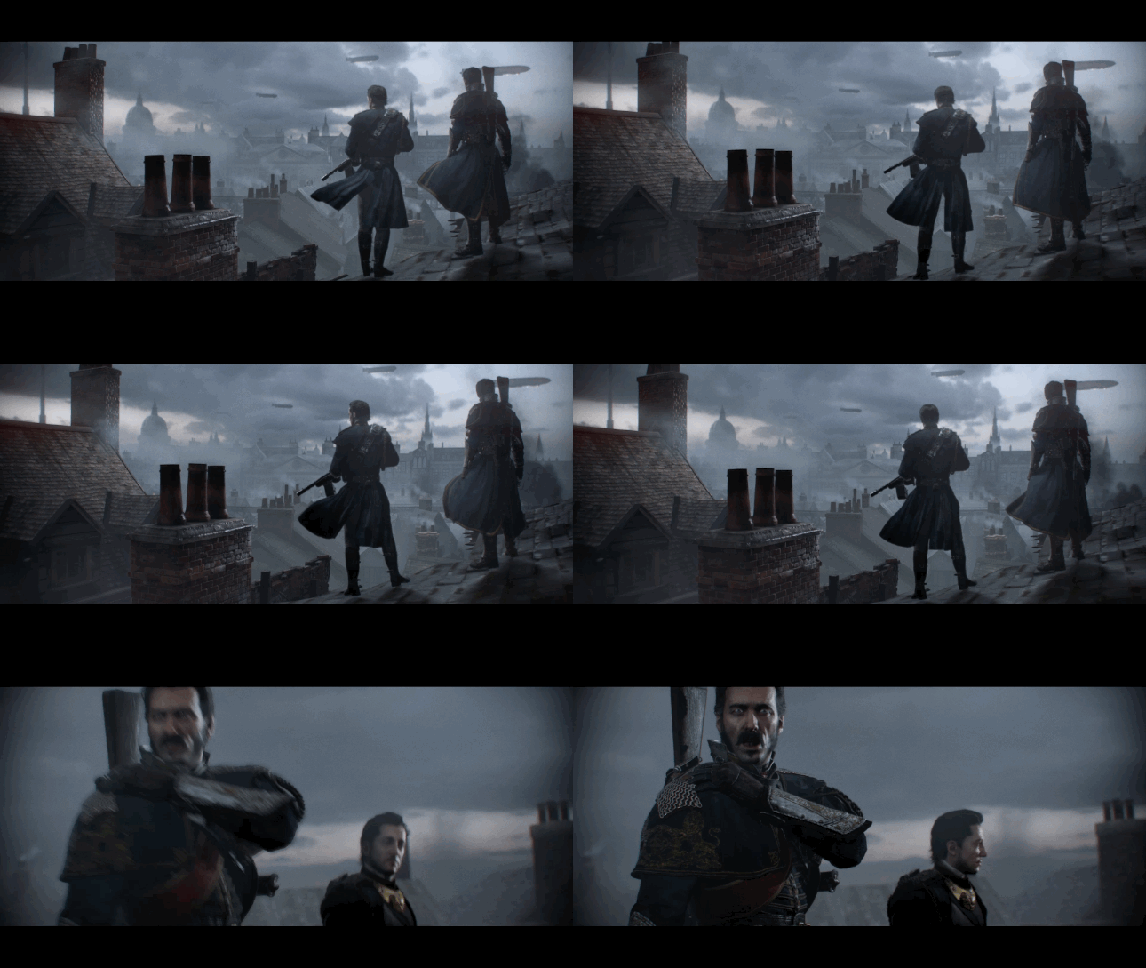
By the way, are you referring to this prank picture that I uploaded on my website? XD

The mirrored art problem was actually purposely very much exaggerated here and there was no deeper meaning behind it.
I think you dislike many of the KoF12/13 sprites for highly subjective reasons. There really is nothing wrong with the majority of examples you posted other than they aren't to your personal liking as a gamer, not designer, and you do have some very specific preferences on top of that. That's what I learned in the time that I've come to know you better. Especially with your women.
Exaggerated declarations like KOF12/13 sprites look "fucking hideous" and KOF14 character models look like "PS2 models" clearly show you are not being very objective or moderate in this regard.
I do also not like certain choices in character design but I am aware that I don't like them for very subjective reasons. Let me think of one...
I don't like that DOA5's Brad isn't devilishly handsome like in DOA4 anymore. And I complained about that in the past. But I get what they were going for now. They made him a more realistic character, showed his age and what alcohol abuse did to him. That certainly does take a toll on your looks after years of abuse...
I really do see your point with Ralph and Clark, they are extremely overdrawn to a point they resemble Hulk, maybe even worse. But if Terry and Kyo already look so overly muscular and broad these two had to be thrice as big I guess. It's just coherence...
The most I agree with you on Knuckles actually. He should be all about his name giving knuckles... Now it's more about his overall strength and he looks more like a dumb muscle head. Which he really isn't as far as I know. But even here I also see a very good reason for altering his design like this. It brings more variation and individualization to the characters' physiques. Old Knuckles looked exactly like Sonic body proportion-wise, he was just colored red. (That's lame character design. Even Luigi looks different to Mario, not just in color!) His actual abilities are supposed to be very different from Sonic though. Why were his limbs still so thin and his feet so prominent? Now he looks much more unique within the sonic game world and like someone who really is the strongest out of the group of main protagonists. And look, I just figured this out myself but according to the Sonic Wikia, which I took a look at just now, the designers actually thought the exact same. Almost scary:
http://sonic.wikia.com/wiki/Knuckles_the_Echidna_(Sonic_Boom)
By the way, are you referring to this prank picture that I uploaded on my website? XD

The mirrored art problem was actually purposely very much exaggerated here and there was no deeper meaning behind it.
Last edited:


