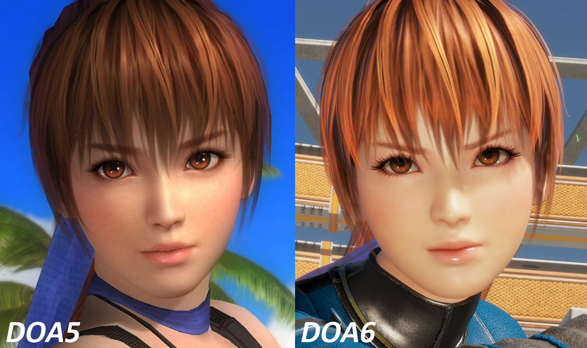
DOA6 Graphics Thread

Tyaren

Well-Known Member
Standard Donor
I'm still stunned every time I see direct comparisons with the DOA5 lighting. How did they mess it up so bad?

DOA6's lighting is much more advanced than DOA5's lighting, but more advanced or realistic does not always mean more aesthetic, which is still very important in video games. Video game visuals are still art after all. With the lack of thought and polish in general of DOA6 I think they implemented the more advanced lighting and simply left it at that. They didn't tweak it much, there was no artist who went over all stages and made sure it actually looks beautiful. In general that stage of quality control seems to be missing in all of DOA6's visuals.
The aforementioned beach stage is a good example. The DOA6 stage designers set out to make a beach stage, so they made a random beach stage. Prior to both DOA6 and DOA5 (but that had at least the pretty fireworks stage) artists would go that extra mile and not just make a random beach stage, they would make a really special beach stage. They would add uniquely bent palm trees or interesting rock formations or they would tweek the lighting and colors for that extra romantic atmosphere...

Doa3_790screen008.jpg


pic_doa3_01.jpg


This still looks more beautiful than anything almost 20 years (!!) later. Seriously, that's so sad and a sign of absolute artistic bankruptcy of modern day Team Ninja.
 
Last edited:

The 4th phase

Well-Known Member
Standard Donor
yeah the doa5 looks better, its sad that used a worse engine for the newer game. maybe if they made lighting a bit a lighter it would probably looker better. Not really an expert on graphic design so everything i say here should be taken with a grain of salt.
 

Dionysus

Well-Known Member
They were helped by the fact that that spot is just as beautiful IRL. Maybe they should try to imitate real world locations more. At any rate, it certainly proves that raw tech matters less than how you use it. Compare the great snow level in 2U to the bizarre snow/ash/whatever thing in 6's car crash stage
 

The 4th phase

Well-Known Member
Standard Donor
Every DOA had until DOA5, that was one of the things that made the series so special. With DOA5 it started to go downhill and finally DOA6 is a showcase of an utter bankruptcy of imagination and artistry.

yeah I noticed doa5 stages wasn't the best with the choices they made. They had a solid gameplay mechanic from a competitive point of view but I wished they took the stages into consideration.
 

moumoua

Member
Well, first of all one has to mention that the DOA6 image is heavily compressed, the DOAXVV image is too, but not as badly, so the DOA6 image lost a good deal of detail that is actually in the game when you play it in an uncompressed manner.
That being said, yes, the overexposed lighting of DOA6 washes out the entire image and makes the character model appear much flatter and undetailed than in DOAXVV, which has more gradients and depth to its image. DOA6 just has really stark, unattractive lighting, with a yellow tint to it.

You can see it it in this comparison as well:

u57avb4d9q8jmotzg.jpg


It's just ugly, the skin is yellow, the sky isn't even really blue in DOA6.

Secondly, DOAXVV uses the same models as DOAX3 and DOA5, they just increased the polygon count of butts and breasts over DOA5, but in general the models are the same. And DOA5 has much more...for a lack of a better word "chunkier" character models for both men and women. You can clearly see how much slimmer Tamaki is in general in DOA6 compared to DOAXVV. I have to admit I personally like the girls being slimmer in DOA6 (I don't like the guys being slimmer also though, lol), because I felt they had really chunky arms and legs and their heads sometimes felt a little small in comparison. At the same time they do also have less curves in DOA6 though. I guess that's a big deal breaker for some, lol.

One clearly improved thing to mention though, and I immediately noticed it when watching the Tamaki teaser: She does now have the DOA6 hands for female characters. They are much finer and elegant than the big paws of the DOA5 models. ;)
I can't agree with you more. You are a great person in this community. I'm realy sad I can' communicate with you because my english is so bad.
I know the big paws of the DOA5 models lol and she now have the DOA6 hands for female characters.
And I know there is something good in DOA6 such as the hands/lip. But the overexposed lighting of DOA6 is too terrible. It's the most serious thing in this game even not many people care. Team ninja really need to realize it.
I also found the differences in different stage/situation. For example, The wardrobe honoka looks much better than the other one. The shadow in her face is ugly when you palying the game.
I really hope Team Ninja will fix the overexposed lighting in doa6u or doa7. But who knows.
1.jpg

20200226233227_1.jpg
 
Last edited:

inochinagi

Well-Known Member
Standard Donor
@rjqnraos19 - I don't know if it's due to the slight difference in angle, but I can see some difference if you look carefully at the naval/bellybutton area and her hands.
 

Ninoasker

Well-Known Member
Now to wait for someone with enough texturing experience to edit the texture files with DOA5 skin textures so we can see how they'd look like in the new models lol
 

SaihateDYNAMO

Well-Known Member
I’m so confused now! Are DOA6’s textures the problem or is it something else? I think the point @rjqnraos19 was trying to make is that her skin looks the exact same ingame in both situations. If a detailed texture like that has been replaced with a solid color, we shouldn’t have to squint to find the differences between the two because both textures are wildly different.

This should NOT be the case, so I think there’s something funky going on with the skin shaders or something. At the same time the original textures don’t look as realistic as they should so idk!

Now to wait for someone with enough texturing experience to edit the texture files with DOA5 skin textures so we can see how they'd look like in the new models lol
I want to see this too! I think that would answer some questions regarding why the skin in DOA6 looks like... this.
 

moumoua

Member
So, I retextured a body texture to solid color.


View attachment 30441

View attachment 30442
like this.

View attachment 30443

NOW THE ORIGINAL

View attachment 30445

NOTHING DIFFERENT WITH ORIGINAL
WTF lol
I can't believe it's true lol. They haven't done enough in the body texture of girls. And the overexposed lighting of DOA6 makes the situation worse when you playing the game. I wish Team Ninja to fix it.
By the way, thank you so much for the “AO Texture”. It's very helpful to me. :marierose:
 

inochinagi

Well-Known Member
Standard Donor
I like the more anime-ish style of DoA5/DoA6 honestly (not saying it's better, I just like it personally). I know a lot of people were actually upset with DoA5's look because it stepped the series closer to a realistic look rather than the more anime look of the previous games, but I think they found a good balance between a realistic and anime style to become more modern. Some people make fun of the style of DoA1-DoA4 models to be "doll-like", but I think they actually hold up well today, I can easilly like the look of the new models as well as those old ones if I go back and play them. I don't want DoA to look realistic, I just want it to be really good at its own style, but it's not doing that in DoA6. I actually have somewhat of a fear is that one day DoA will go the uncannilly realistic style of Capcom's recent games like DmC, DMC5, RE3, etc. whither by TN or if they decide to offsource it to another developer one day, maybe a western one. Nioh 2 does still look good though, I like its style better than any of Capcom's more realistic games for sure.
 
Last edited:

Jackie Chan Fan

Well-Known Member
I wish DOA6 characters look as great and detailed as that in Nioh (1 or 2). It's not bad. It's just sometimes it looks weird in certain angles, particularly the neck.
 

Tyaren

Well-Known Member
Standard Donor
I don't know why, but I actually played a little DOA6 again today. During Marie Rose's loser animation I noticed that the heart ornament on her back didn't look quite as I remembered it. I then jumped into DOA5 to compare it to the original one:

49625910721_5525d0ee2e_o.jpg


In DOA6 it's just made of shapeless, undefined metal sausages and clumps, while it's an actual shapely and detailed piece of jewelery in DOA5.
 
ALL DOA6 DOA5 DOA4 DOA3 DOA2U DOAD
Top