The Art Style and Graphics Discussion

Jadeinchains

Well-Known Member
I wished they'd just scrapped that Cyberpunk game. (No offense. XD) It's a setting I don't care about at all. I want a Witcher 4, even with Ciri.

408835_tv-what-shock-gasp-no-way.gif


Why I've never! I'll have you know cyberpunk is one of the best sub genres with a gorgeous art direction taking great inspiration from it's decade of the 80's! Big fur coats, rain and bright neon.

Though I will say after they release Cyberpunk 2077 I'd like to see the witcher 4, I'd want Ciri to be the protagonist though now since I'd be interested in seeing how she is. I don't know where it would take place though?
 

Argentus

Well-Known Member
i just picked up a 40 inch tv. not 4k because that's outside my price range, but still an upgrade from my old 19 inch tv from 2008 that doesn't even have hdmi.

That said...um....not noticing a huge different from regular to hdmi. I mean it was still hd, just composite instead of hdmi.
 

Tyaren

Well-Known Member
Standard Donor
This fits in perfectly here:


Looking at these cities, Arkham City in Batman Arkham Knight really is the graphically most impressive city that I have seen so far in a video game. I wonder how much it being dark and rainy all the time helps. ;)
 

Tyaren

Well-Known Member
Standard Donor
RiMe is back, guys, RiMe is back! :D

13958174_1371579402856519_2077456110935016688_o.jpg


And it will be coming in May to PS4, Xbone, PC and even the Switch.

Here's the new rereveal trailer:

Something doesn't seem to be quite right with the colors though in this trailer. The developers already stated that the game hasn't become less colorful, the muted colors have to do with the compression of the IGN exclusive trailer.

Muted colors aside, Rime is imo one of the most beautiful games this gen. I absolutely adore the setting and art style. So glad it is back after it's separation with Sony and it's apparently troubled development.

IGN playd the first chapter by the way and they think it is really good:
http://www.ign.com/articles/2017/01/06/rime-hands-on-answering-the-burning-questions-a-ign-first
 

Argentus

Well-Known Member
RiMe is back, guys, RiMe is back! :D

13958174_1371579402856519_2077456110935016688_o.jpg


And it will be coming in May to PS4, Xbone, PC and even the Switch.

Here's the new rereveal trailer:

Something doesn't seem to be quite right with the colors though in this trailer. The developers already stated that the game hasn't become less colorful, the muted colors have to do with the compression of the IGN exclusive trailer.

Muted colors aside, Rime is imo one of the most beautiful games this gen. I absolutely adore the setting and art style. So glad it is back after it's separation with Sony and it's apparently troubled development.

IGN playd the first chapter by the way and they think it is really good:
http://www.ign.com/articles/2017/01/06/rime-hands-on-answering-the-burning-questions-a-ign-first

as someone who regularly plays colorful games, i will say while it doesn't look bad, it certainly doesn't stand out, so my second question is whats the actual gameplay like? I read the article and its kinda...vague? You just explore and no combat. Not saying I want combat, but it sounds mostly like a puzzle exploration game, am I getting that right?
 

CyberEvil

Master Ninja
Staff member
Administrator
Premium Donor
I'll probably play mostly in the 60fps mode but I'm looking forward to testing the 4k mode out. Looks excellent.
 

Tyaren

Well-Known Member
Standard Donor
The first 20 minutes of RiMe:


So gorgeous...Looks like the love child of Zelda Windwaker and Ico.
Just the pixelated shadowmaps are marring the overall image. :/ That will probabaly be less of a problem on Pro and PC though.
 

KasumiLover

SovereignKnight_
Premium Donor
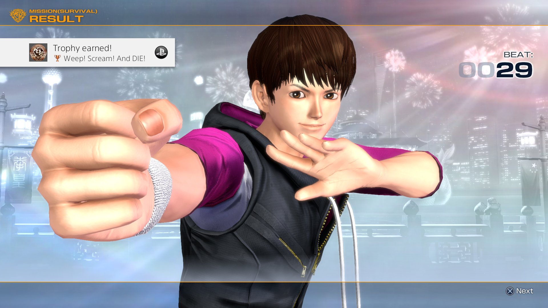
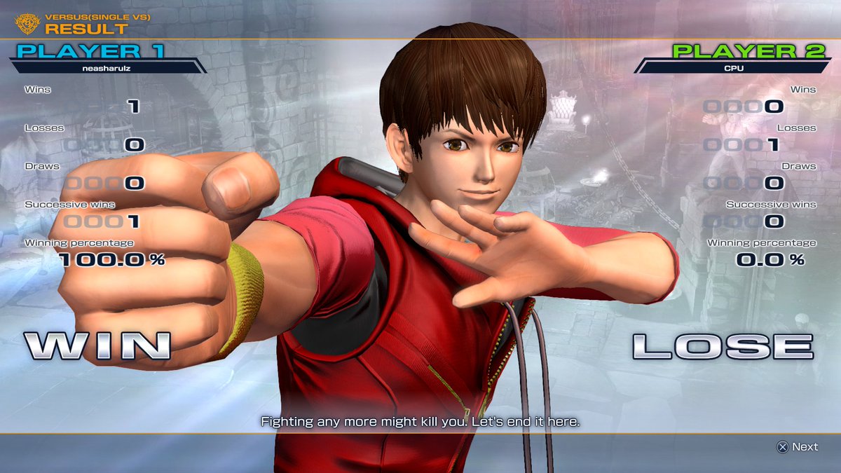
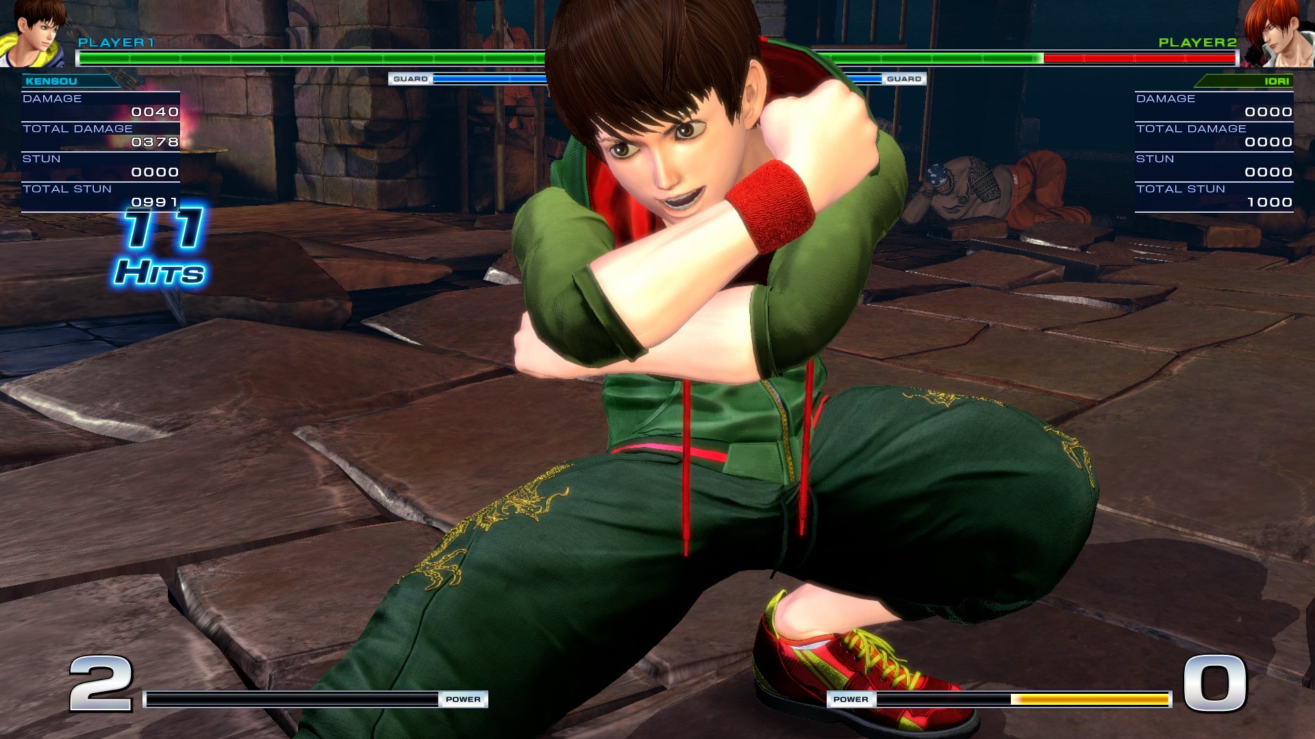
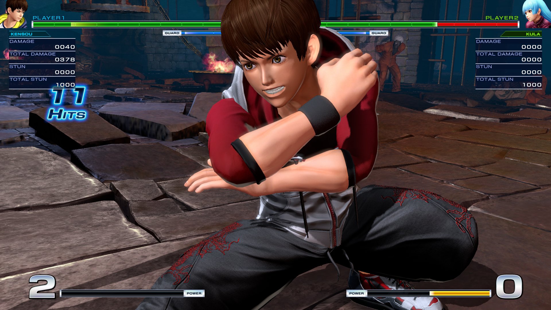
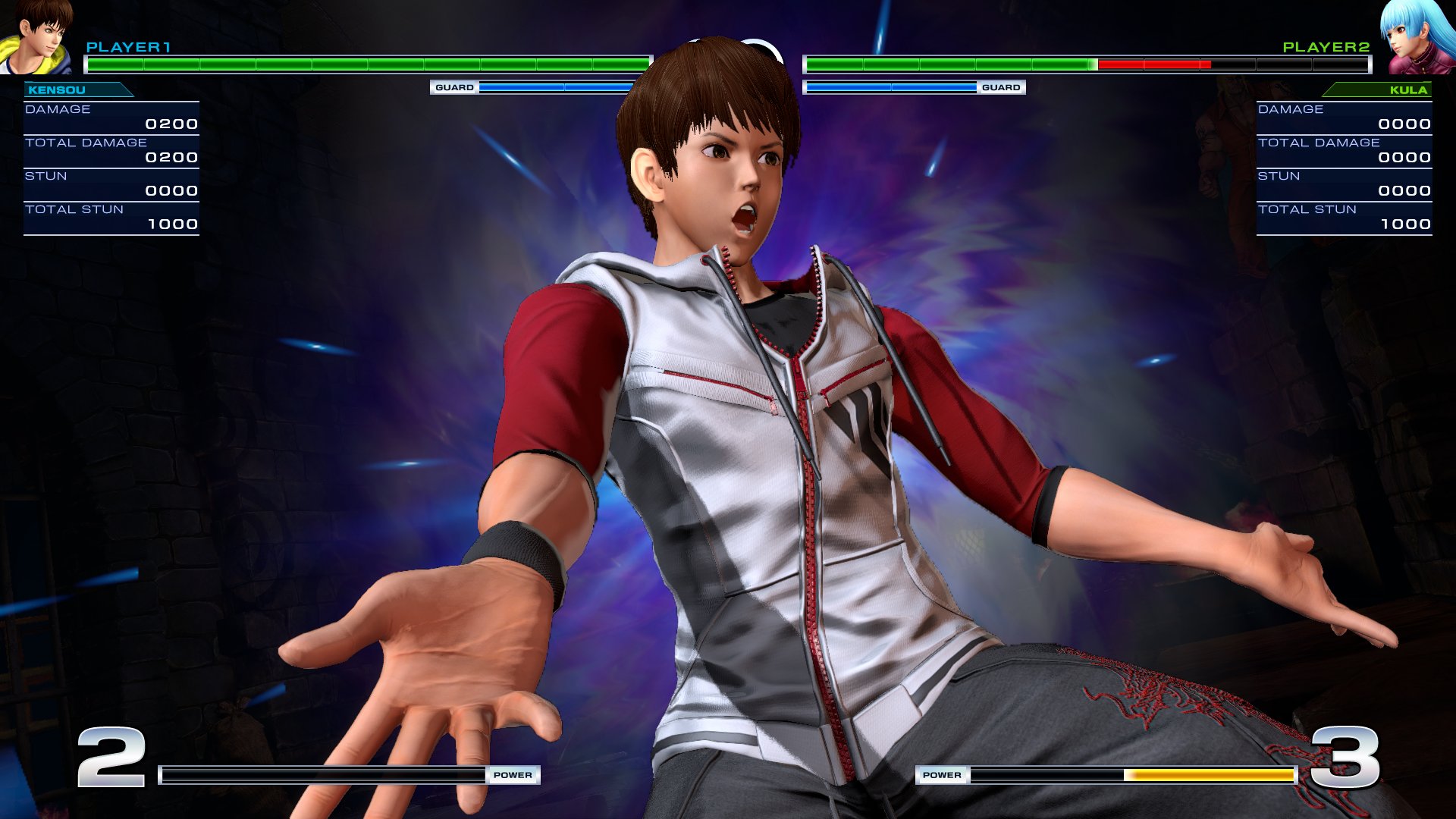
Peep dat difference tho! I'm pretty impressed with the look now, it's way more detailed and crisp. I remember wanting to use a screenshot before the update of kensou in this same pose but didn't because it wasn't crisp, but now look at it!
C12k77wXUAA_V2_.jpg:orig

C12k-mwXUAEXi2f.jpg

C12lVj8XEAEOiW7.jpg:orig

C12lQJ0W8AE8FD9.jpg:orig


And then my favorite pic:
C12mzitXUAc-vtw.jpg:orig
 

Argentus

Well-Known Member
Peep dat difference tho! I'm pretty impressed with the look now, it's way more detailed and crisp. I remember wanting to use a screenshot before the update of kensou in this same pose but didn't because it wasn't crisp, but now look at it!
C12k77wXUAA_V2_.jpg:orig

C12k-mwXUAEXi2f.jpg

C12lVj8XEAEOiW7.jpg:orig

C12lQJ0W8AE8FD9.jpg:orig


And then my favorite pic:
C12mzitXUAc-vtw.jpg:orig


gah. That game should still never use closeups. The models look like a college students first 3d project. No detail in the face, and then what the fuck is going on with textures on his palms and the embroidering on his pants?! The palms look like the accidentally got the normal maps reversed so what are supposed to be creases in, actually go OUT. And the embroidering the textures don't like up with the actual bump maps so it looks "off" The right pant leg looks way better than the left in those pics though so maybe its an angle or lighting issue.


btw did they ever fix Mai's bangs? I remember in the demo they weren't even actually aligned with her actual hairline, so the closeup on her ultra looked especially bad XD
 

KasumiLover

SovereignKnight_
Premium Donor
gah. That game should still never use closeups. The models look like a college students first 3d project. No detail in the face, and then what the fuck is going on with textures on his palms and the embroidering on his pants?! The palms look like the accidentally got the normal maps reversed so what are supposed to be creases in, actually go OUT. And the embroidering the textures don't like up with the actual bump maps so it looks "off" The right pant leg looks way better than the left in those pics though so maybe its an angle or lighting issue.


btw did they ever fix Mai's bangs? I remember in the demo they weren't even actually aligned with her actual hairline, so the closeup on her ultra looked especially bad XD
Nope her bangs are still as is xD and yeah I definitely agree on the graphics, close ups just are to be avoided all together, the game looks better but there's still some corners they could cut to further flesh it out imo.
 

KasumiLover

SovereignKnight_
Premium Donor
That forth pic of Kensou looks like he has tan skin.
I think they intentionally gave him more healthy looking skin, he was kinda pale before. And if you look at his eyes the irises are now smaller and more natural looking, and they've kinda gave him a bit more arm definition I guess because he uses them half the time XD
 
Last edited:

DontForkWitMe

Well-Known Member
Impressive new Horizon: Zero Dawn trailer:


This look so good...and that huge, beautiful city! O:

Getting this day one, Hopefully Guerrilla Games knocks this outta the park, everything they've shown so far looks amazing and can't wait to play this on my pro in 4k hdr goodness.

On another note

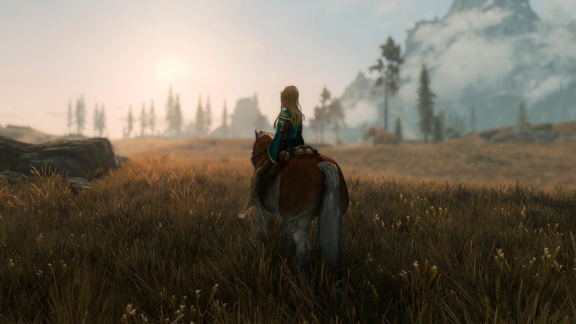
Skyrim still looking damn good for a 6 year old game...


when modding the ever loving shit outta of it that is....


32220138326_1c8bc279bb_o.jpg


32220139416_9b9016d89c_o.jpg


31448344893_3a5569c8f8_o.jpg


32109298252_0c24814ca0_o.jpg


32258597955_230b66c195_o.jpg
 

Tyaren

Well-Known Member
Standard Donor
Great Skyrim shots everyone! :) Though I don't know if you can any longer call it Skyrim when it has been modded into Oblivion. Pun intended. ;P

The Tempest, Mass Effect: Andromeda's new ship, looks pretty amazing I have to say:


That reminds me of Alien Isolation and how gorgeous it looks:


I don't know why but I somehow really love these kinds of starships. I especially like the 70s inspired design of the Alien ships. More angular and sturdy than the organic and light designs of most other starships.
 
Last edited:
ALL DOA6 DOA5 DOA4 DOA3 DOA2U DOAD
Top