You are using an out of date browser. It may not display this or other websites correctly.
You should upgrade or use an alternative browser.
You should upgrade or use an alternative browser.
DOA5U wanted Costumes
- Thread starter Dan
- Start date
Rawbietussin
Well-Known Member
Now... Before I crumple this out from existence and eventually throw it to the trash.
Tell me what you guys think and should I still go through with this?

Tell me what you guys think and should I still go through with this?

@Tyaren when are YOU going to make an outfit I've been waiting for it...
I am at it right at the moment! :3
Kronin
Well-Known Member
@Argentus: I agree with Tyaren' suggestions
Maybe could be necessary to unbotton a little more the "skirt" for allowing to see better the shorts behind it?
Is this an outfit for Momiji? The design seems to me a pretty good idea!Now... Before I crumple this out from existence and eventually throw it to the trash.
Tell me what you guys think and should I still go through with this?

Maybe could be necessary to unbotton a little more the "skirt" for allowing to see better the shorts behind it?
Now... Before I crumple this out from existence and eventually throw it to the trash.
Tell me what you guys think and should I still go through with this?

I think it's awesome and really fashionable.
Just one question...is that supposed to be Helena or Sarah?
David Gregg
Well-Known Member
. Nothing you'd change or want different? trying to make it supportable. Also, @DontForkWitMe here's the first sketch of Leon, this in the ballpark of what you want?
Since you're only allowed to make 1 costume submission I'd say stick to Leon, @Argentus this looks great.
Pigi86
Active Member
I can dig it. I say, unzip the jacket halfway, hood down (like his skeleton halloween costume), rolled sleeves. Silver necklace, and wrapped hands or some sort of fighting or fingerless gloves?
For now the hood will stay because I like it. He will wear fighting gloves
Not bad, but I'd like to see it stray from his C1 even a bit more. Maybe if the hood were down, or if the hoodie had some red/orange on it.
Good idea, I will put some red colors on it.
I prefer the color and the unziped version here.
I will try the unziped.
Thanks for the critics people
Rawbietussin
Well-Known Member
@Argentus: I agree with Tyaren' suggestions
Is this an outfit for Momiji? The design seems to me a pretty good idea!
Maybe could be necessary to unbotton a little more the "skirt" for allowing to see better the shorts behind it?
I think it's awesome and really fashionable.Now you should focus on a presentation style, that is less cute/chibi, that would give your design a bigger impact and approachability.
Just one question...is that supposed to be Helena or Sarah?
Thanks and it's supposed to be Sarah by the way. The flamingos should have hinted things lol.
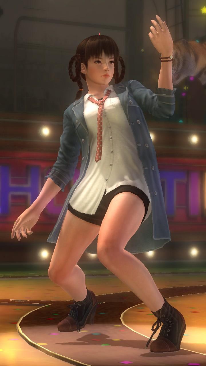
@Kronin: The "skirt" is actually just the bottom half of the buttoned shirt. It's just being held together by the belt. I wanted to give Sarah more shorts/skirt costumes. I was thinking of changing her shorts into something more spandex-like but I'm also afraid that it looks similar to Leifang's C3. Should I change colors or use different shoes?
UpSideDownGRUNT
Well-Known Member
Okay since I can't draw and no matter how many times I try it all looks awful and you can't tell what I'm getting at so here's a few ideas I have for Ein.
I'd like to see Ein in something modernised and snazzy kinda like what I posted before
Red checked/plaid shirt/jacket
 opened up with a white tank top/black shirt underneath.
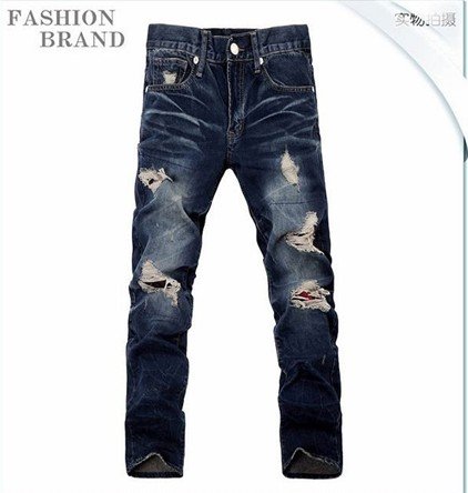 stone washed jeans paired with white studded belt.
finished off with
 black/white sneakers/skateshoes (obviously w/o DC logo lol)
Ofcourse this would need to be styalised to fit Ein's personality.
I'd like to see Ein in something modernised and snazzy kinda like what I posted before
Red checked/plaid shirt/jacket

finished off with

Ofcourse this would need to be styalised to fit Ein's personality.
Rawbietussin
Well-Known Member
It just so happens my design DOES looks similar to Leifang's C3. The boots, the shorts underneath a long buttoned shirt. -facepalms and bang my head on the wall- #FashionFailure

Argentus
Well-Known Member
because a, daisy dukes don't suit her, and b, can't remove the visor.I don't think i've seen this outfit. Why don't more people use this? Also if these were jeans I'd have an outfit I'd pick for her, aside from her yellow MMA one.
Thank you, I'd been struggling with that. trying to show enough to warrant customization options.@Argentus I've got some tips for you. I hope, that is alright?

Imho you should weaken the angle, Mila's pants are hanging from her hips. Your version so far looked more like the left version here. It's hardly possible for pants to sit like that on the body. It doesn't really look casual.
Also her slip shouldn't be pulled so high. It has that dated 90s/80s look. Current fashion has slips/bikini bottoms situated pretty low (just take a look at other DOA outfits for the girls).
So far it looks, as if you really want to emphasize her slip showing, but if you tone it down a little, it looks just as sexy but less forced. Sometimes less is more.
The catch is, I'm not going to submit the Leon design, its actually that of @DontForkWitMe , I'm just drawing it for him, then i think he's submitting it. I hope.Since you're only allowed to make 1 costume submission I'd say stick to Leon, @Argentus this looks great.
Last edited:
Okay since I can't draw and no matter how many times I try it all looks awful and you can't tell what I'm getting at so here's a few ideas I have for Ein.
I'd like to see Ein in something modernised and snazzy kinda like what I posted before
Red checked/plaid shirt/jacket
opened up with a white tank top/black shirt underneath.
stone washed jeans paired with white studded belt.
finished off with
black/white sneakers/skateshoes (obviously w/o DC logo lol)
Ofcourse this would need to be styalised to fit Ein's personality.
Great look and I agree Ein needs a more current look. I've said it at other times, but Ein looks like his character design is stuck in the 80s. I've always suspected Ein as Itagaki's self insert into the series.
Now... Before I crumple this out from existence and eventually throw it to the trash.
Tell me what you guys think and should I still go through with this?

I like it makes her look like she belongs in doa her defaults always make her stand out.
Rawbietussin
Well-Known Member
I like it makes her look like she belongs in doa her defaults always make her stand out.
Thanks but I need to make the costume look less like the one in Leifang above. If I were to push through with it.
Sarah has always been versatile in a lot of her costumes. She can be casual in 2 of her outfits and a formal dress.
Thanks but I need to make the costume look less like the one in Leifang above. If I were to push through with it.
Sarah has always been versatile in a lot of her costumes. She can be casual in 2 of her outfits and a formal dress.
This is true, although they stand out they're don't look bad.
Rawbietussin
Well-Known Member
I'll put Sarah on hold for now. I might redesign it later.
Gonna try on Helena next before I decide on who's costume should I submit.
Gonna try on Helena next before I decide on who's costume should I submit.
I wonder what would happen if everyone submitted a design with a Tengu mask in the character.
A character with a Tengu mask would win.
SilverForte
Well-Known Member
I think I got a good idea on how I want my Busa outfit to be, I'll post something in the next few days hopefully.
