Creative Art Input Thread

Argentus

Well-Known Member
Thanks Jadeinchains, I'm glad you like my stuff! ^o^ ♥
I only have the time/energy to do rough paint sketches cause I'm working so much lately. (saving up for a new computer and cintiq.)

I want a cintiq soooo baaaad

unfortunately all I can get is temp work, so I can't "save up" for one. This computer alone completely cleaned me out, lucky I managed to get enough for MangaStudio before work stopped again.
 

Sotherius

Well-Known Member
Damn @Kodachi this is some serious painting skills you have. I can never imagine myself giving form to pictures without having lineart honestly.

Though you said you lack time, i wish to see you finishing a piece and giving it full detail.
 

Argentus

Well-Known Member
trying this picture again since I switched from photoshop to Clip Studio Pro/Manga studio

MysterioXItachi.jpg


any suggestions/tips on doing lineart?
here's the original attempt in photoshop for comparison

MysterioXItachiRoughsketch.jpg
 

Sotherius

Well-Known Member
build your line from many smaller strokes

That is the way i do it, and it works very well. So i also advise on that.

@Argentus Keep in mind as well that Clip Studio has a stabilizer on the pen tools so you can get more consistent lines. Another thing, is to have a very solid sketch to work with...

Now i'm looking for some advice here...

I'm honestly terrible with composition, i don't know where to start, and where to go. I have no idea how to build a pose or a picture that will be solid to be, i just got too used to doing the same poses and faces, and i'm trying to change that.

Recently i did this DOA fanart, trying like a diamond kind of shape, don't know how successfull i was, painting a bit lazy like always, since i don't have as much fun working there.

C1V7FHmWIAAiWsz.png


Also trying to force myself to build more dynamic shots and use perspective. so let's see how that works.
 

Tyaren

Well-Known Member
Standard Donor

I hope you don't mind me giving some critique to this older post. :)
(Please excuse my English. In casual conversation it holds up pretty well, but once I try to explain something in a more technical way, it often fails me. :( )

1) Use less screen tone. It makes the image look cluttered, static and without contrast. This is how you use screen tone properly:

soul-eater-233390.jpg


Try to create contrasts of white/blank, black and grey screen tone. As a rule of thumb: Less screen tone is more screen tone. ;)
For your page I would suggest much more black areas, for example her leg warmers, arm warmers and scarf, but also by creating some cast shadows. There is a bright moon shining on your page, which is the perfect light source.
In hand made manga the artists usually scratch away some of the screen tone in certain places to create more texture and volume. (You can see this quite well on the upper panel on the example page.) You should also do that with digital manga pages. It would add more 3-dimensionality to your page as well.

2) Ayane's pose seems unnatural.
You thought there is dynamic missing in this page and you are perfectly right. I have to guess what Ayane is actually doing here. I suppose she is walking towards us here, right? It seems more as if her upper body is completely straight and static and her legs are kind of dancing.
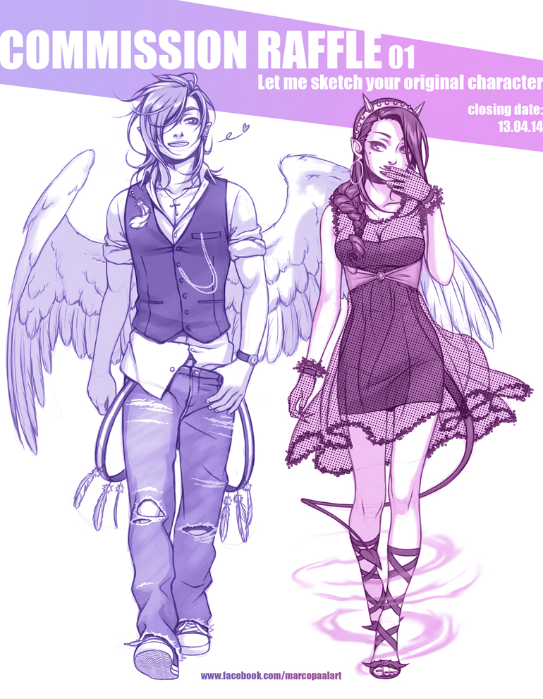
When a human walks (but also dances), his whole body is moving and shifting and that in contrary ways. Here's an older work by me as an example:

commission_raffle_facebook_cover_by_tyaren-d7dznc4.jpg


See that hardly anything is really straight here and when the left shoulder shifts backwards, the left hip shift forwards. Walking feet are situated more in a line after one another than on two different lines next to each other. That's especially true for the stereotypical female catwalk. In your image Ayane has her leg and feet situated in a very unnatural way.

I hope this helps you a little?
 
Last edited:

Argentus

Well-Known Member
everyone once in a while I toy with trying to draw again but i've mostly given up.

Did a practice sketch while watching netflix.

SylvieSketch.jpg
 

KasumiLover

SovereignKnight_
Premium Donor
I got a few face sketches that I should post here soon, although they look like ass. XD Also I accidentally learned how to draw Sie Kensou's haircut...
 

Sotherius

Well-Known Member
everyone once in a while I toy with trying to draw again but i've mostly given up.

Did a practice sketch while watching netflix.

View attachment 22686


Hm in general i think you were successful in this pic, but i think some points should be noted, mainly how the shoulders are lined with the breasts, when shoulders will always be in a higher position, and also, remember that a tail is just an extention of someone's spine, so, it should start lower than it is in the picture, like, way closer to the butt than it is right now that is on her back, another thing, i would say, is that while her right arm could be well placed to the point of not being visible in the pic like it is right now, i think it would look a bit better if you could see at least some part of her right arm, her ear also seems to be too close to the eye, too much at the front of her face.

Also, don't give up, just don't, please, don't ever give up.
 

Argentus

Well-Known Member
Hm in general i think you were successful in this pic, but i think some points should be noted, mainly how the shoulders are lined with the breasts, when shoulders will always be in a higher position, and also, remember that a tail is just an extention of someone's spine, so, it should start lower than it is in the picture, like, way closer to the butt than it is right now that is on her back, another thing, i would say, is that while her right arm could be well placed to the point of not being visible in the pic like it is right now, i think it would look a bit better if you could see at least some part of her right arm, her ear also seems to be too close to the eye, too much at the front of her face.

Also, don't give up, just don't, please, don't ever give up.


good points, i'll try to watch out for that. The tail is the only one i'm not sure how to fix because I don't want her actual buttcrack showing, because I want her capris to simply be hanging low enough on her hips to allow the tail (I hate the whole "Hole in the pants" thing people do for tails so i'm trying to avoid that).

the ear and breast though i'll try to fix, thanks!

the arm....i just kinda intentionally didn't bother with, that's on me haha. I'm terrible at drawing arms so I was trying to avoid it.
 

THE_WORST_KOKORO

Well-Known Member
Standard Donor
Oh my god this is great! Do you charge for request??? :-D
Yes, I charge for commission works. This one in particular is for TEAM EXCEL. I have some other chibi arts I'm working on as well. Honoka is finished and should be colored by the end of today.

Keyonno showed me this on Kik he must be your friend I think, and I told him, Yin is a excellent artist, you should commission him.
Anyways, your Chibi Pai chan is cute beyond words, especially in this pose. ♥
You got my badass seal of approval mate. ;):pai::4::6::6::P+K:
Thanks a bunch! He's a friend of mine.
The pose is a call back to her virtua fighter remix artwork.
"Blueberry Pai" was my favorite entry for her attire.

(i need to redownload kik)
 
ALL DOA6 DOA5 DOA4 DOA3 DOA2U DOAD
Top