Creative Art Input Thread

Jadeinchains

Well-Known Member
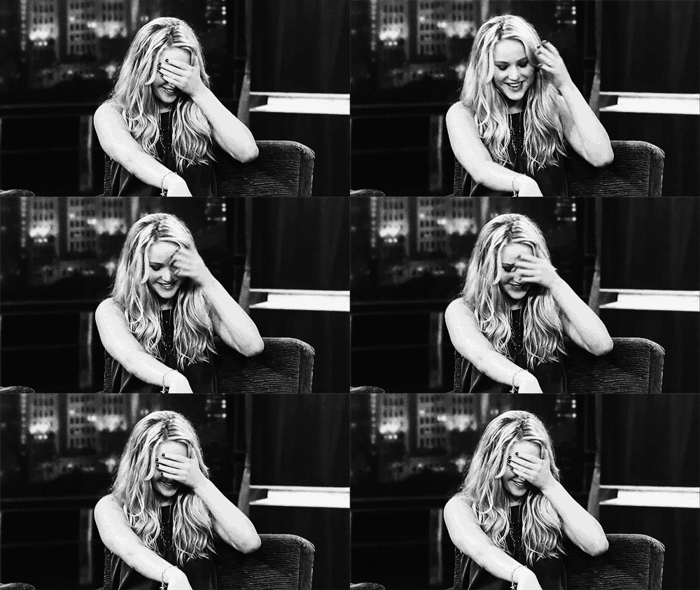
latest

tumblr_m8ujvfANdP1rtd7fh.gif

Jadeinchainsembarrassed.JPEG

See I'm helping destroy everybody's phones with gifs spare me!
 

Tyaren

Well-Known Member
Standard Donor
Lol omg no not like that! I mean that your not afraid of the constructive criticism.

I think it is a great thing and that's how you better think in this business. XD I am used to receiving and giving critique. Working with editors for some of my comic and book projects, hearing what my readers have to say (the younger they are, the more relentless they are) and giving (hopefully) constructive critique as a guest tutor in uni gave me a thick skin but also the means to work with and even enjoy critique.
In uni I stumbled from time to time over students that were completely impervious to any sort of critique (and some really took it the wrong way)...coincidentally these were also the students that made the least progress in class over the course of several semesters. The open-minded students however made some huge steps forward. Some even thanked me for that. :)
 
Last edited:

Jadeinchains

Well-Known Member
That definitely sounds like a good thing, I can really see how that would help to see the areas you need to improve in, I also want to continue getting better myself so I'll surely need to grow a tougher skin to critiques for the areas I need to improve in. :)
I was looking at the face book page your artwork's on and I saw a lot of your work I'd never seen more and it was fun to look through, I also saw some of your comic.
 

Kodachi

Well-Known Member
Standard Donor
Worked for the portfolio on some older concepts again:

Fairy Tale Stepmother for a fictional fighting game. Influences were characters like Ivy (Soul Calibur), Cinderella's stepmother (1950 Disney animation) and Angelina Jolie. Other influences were dominatrixes and circus ringleaders.

View attachment 21740

View attachment 21736

Which costume concept do you prefer for her?
did a little mix and match based on my preference.
Untitled-6.png
 

Tyaren

Well-Known Member
Standard Donor
Kinda didn't even wanna attempt the ponytail honestly lol. Dunno how to do forward facing view on something like that.

Make it rounder and don't be afraid to use guide lines.

argentus.jpg


Her face is pretty though, even without a nose. :)
 

Argentus

Well-Known Member
Another practice sketch after getting off work before I ran errands. I drew over and colored one of my pencil sketches. It's really hard to adjust from drawing on the paper in front of you, to coordinating from a (small, even) Wacom Tablet next to you to the monitor in front of you. It's why I want a Cintiq monitor SO BADDDD.

SylvieTest.png


Not gonna try anything fancy until i practice more. @Tyaren Any tips for doing non messy lineart?
 
Last edited:

KasumiLover

SovereignKnight_
Premium Donor
Nice, I love the eyes, and the hairstyle coupled with the ears is awesome! I really ought to start drawing and sharing more myself, I've been in a bit of a slump in terms of new designs...
 

Jadeinchains

Well-Known Member
Another practice sketch after getting off work before I ran errands. I drew over and colored one of my pencil sketches. It's really hard to adjust from drawing on the paper in front of you, to coordinating from a (small, even) Wacom Tablet next to you to the monitor in front of you. It's why I want a Cintiq monitor SO BADDDD.

View attachment 22075

Not gonna try anything fancy until i practice more. Any tips for doing non messy lineart?

It looks good, Cool to see that you have a tablet now. It will be interesting to see what you make for the next design contest!
 

Argentus

Well-Known Member
I have this problem too. They say it gets easier with time but i never seem to get ''natural'' with my wacom. Oh well i like water coloring anyway...

Anyone have problems to finding their own style? I kind of dropped anime style a long time ago but i still haven't settle with anything. I get inspired with a lot of different artists. I mainly want to have my own style since i'm thinking having my own classic lolita clothing line and i need to do prints for them.
I could never do "anime" style in the first place but I've kinda drifted to a western comic style. not hyper realistic, but like a Disney film (the eyes) with a touch of JoJo (The shadowing on the nose and general facial structure). But I don't really intentionally do a specific style, unless it's intentionally for contrast. So i guess you could describe my current style as "Jojo done by Disney" lol. (That or Blizzard's art style. at least in terms of faces.)

I'm just kinda doing whatever is the easiest way to draw. Like I suck at noses so I found myself picking up that shadowing on the nose ridge to help, from Empowered.
 

Hayabusiness

Well-Known Member
I think the best way of finding your own thing is real life drawing. It's the best way to let go of stereotypes and the guaranteed key to improvement alongside constant practice and work.
 

KasumiLover

SovereignKnight_
Premium Donor
For me as you guys saw before, I like the cutesy meets anime aesthetic in my drawing, I love big eyes and almost circular heads for both boys and girls, but guys I tend to make have thicker eyebrows and less huge eyes. Hairstyle wise i prefer longer hair, but I also like spiky unruly hair since you can be expressive with it. I need to improve in my body drawing tho, I make the guys too curvy and the girls too hourglass which isn't intentional at all.
 

Sotherius

Well-Known Member
I'm having some trouble maybe the artists here could help me.

Since i think one of the strongest points on my artwork is the lineart, recently i had the interest of making completely black and white pieces.

And so, i'm trying to dabble with screentone settings on clip studio pro to work with darker areas, or toning and general, but i'm having trouble, because i'm not getting tones the way i wanted, so i was wondering, how viable is just to use solid colors in shades of gray to complete my pieces, here are some tests i'm working with one pic i'm making, so sorry if that comes up somewhat heavy.

The problem is that it doesn't look good at certain zoom levels, and when compressed into an image file, it gets even worse and more messy.

Don't know if this link will work, but here.

http://imgur.com/a/WBAol

Those are my attempts at using screen tones.
 

Argentus

Well-Known Member
I'm having some trouble maybe the artists here could help me.

Since i think one of the strongest points on my artwork is the lineart, recently i had the interest of making completely black and white pieces.

And so, i'm trying to dabble with screentone settings on clip studio pro to work with darker areas, or toning and general, but i'm having trouble, because i'm not getting tones the way i wanted, so i was wondering, how viable is just to use solid colors in shades of gray to complete my pieces, here are some tests i'm working with one pic i'm making, so sorry if that comes up somewhat heavy.

The problem is that it doesn't look good at certain zoom levels, and when compressed into an image file, it gets even worse and more messy.

Don't know if this link will work, but here.

http://imgur.com/a/WBAol

Those are my attempts at using screen tones.
Damn, your lineart IS good.

Compression I can't really help you with, except point out that pics aren't supposed to be zoomed in that much when they're done anyway.

But the "solid gray" works, it looks good on lisa.

I WILL say that Tina has some serious crocodile arms proportions going on there though.
 

Hayabusiness

Well-Known Member
Of the pictures you posted, the first and the second seem the best start so far.

I think your idea works for this sort of lineart, so I'd go for it. It gives off a nice comic book feeling.
 

Sotherius

Well-Known Member
I WILL say that Tina has some serious crocodile arms proportions going on there though.
I thought so myself as well, but everytime i redline or try to measure it, it seems like the perfect size (with the starting point of the hands matching the end of the groin region. I would say that lisa's arms are a bit too long to be honest.

And now i can not unsee it anymore, so i'll just drop and move on.
 
Last edited:
ALL DOA6 DOA5 DOA4 DOA3 DOA2U DOAD
Top