Creative Art Input Thread

Kronin

Well-Known Member
Why I'm discovering the developments of this thread just now? I think that I have many interesting pages to read, better stop with likes before doing it xD I just gave a brief look to advices and art, great work guys.

Any Parasite Eve fans? I played PE2 to death. Here's some Aya

Yes, I love that series, just a shame that "The 3rd Birthday" is too much different from the original one for being considered truly a sequel. I admit to have a weak point for the Aya/Eve (the little Eve not the PE1 villain) mother-daughter/sisters relationship... the usual me that end always to like unpopular/secondary characters that no one cares for xD

This is a super simple and quick process to make perspective easier

1 Draw a side view stick figure doing desired pose
2 Draw the bottom of a box from desired camera angle
3 Place the character inside the box

Basically if you can draw a box in 2 point perspective you can draw a person as long as your brain doesn't shut down during step 3.

I had to try it asap, the recent challenge design could be just the perfect chance :p
 
Last edited:

synce

Well-Known Member
Why I'm discovering the developments of this thread just now? I think that I have many interesting pages to read, better stop with likes before doing it xD I just gave a brief look to advices and art, great work guys.


Yes, I love that series, just a shame that 3rd Birthday is too much different from the original one for being considered truly a sequel. I admit to have a weak point for the Aya/Eve (the little Eve not the PE1 villain) mother-daughter/sisters relationship... the usual me that end always to like unpopular/secondary characters that no one care for xD


I had to try it asap, the recent challenge design could be just the perfect chance :p

Oh hey welcome to our secret hideout... and yeah Third Birthday was such a huge letdown, don't remind me it exists lol But if you like PE2 Eve and Aya you might get a kick out of stuff I have planned. Eve is one of my fav characters to draw :)
 

Argentus

Well-Known Member
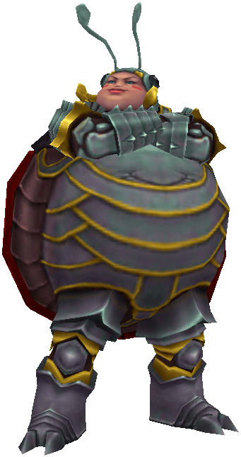
Oh you mean like fat fat? I love drawing fat chicks, athough this is about as far as I can take it :p

View attachment 10903
Lol I was thinking like
Cindy_FFX_Render.png

That's the impression I was getting off the helmet and round face st least.
 

synce

Well-Known Member
Lol I was thinking like
Cindy_FFX_Render.png

That's the impression I was getting off the helmet and round face st least.

lol Hey I remember her... And you mean the redesign I posted earlier? Yeah she's a kid, I tend to draw them with rounder faces even if they're skinny ^_^

Ah might as well post the full body shot

View attachment 10915

Was gonna use it in a project but decided to scrap it
 
Last edited:

Argentus

Well-Known Member
lol Hey I remember her... And you mean the redesign I posted earlier? Yeah she's a kid, I tend to draw them with rounder faces even if they're skinny ^_^

Ah might as well post the full body shot

View attachment 10915

Was gonna use it in a project but decided to scrap it
That is horrifyingly cute. It looks like a high end car seat lol.
 

synce

Well-Known Member
Man what kind of car seats did you grow up with... mine sho nuff didn't have wings or destructive powers. And don't let the cute face fool you, SHE WILL CHOKE YOU.
 

Argentus

Well-Known Member
have my computer back for now. (Just in time for the costume contest, for once. SWEET.) Anyways doing a color test of my redesigns of those marvel girls but i'm not really happy with it. Trying to keep the general color scheme the same but...Any suggestions?

Marie&JacindaRedesigns.jpg


On the left, Marie Batroc (Daughter of Batroc the Leaper), Traded out the bodysuit for a cheerleader style miniskirt and long sleeved top. Shoulder is just some fashionable asymmetry. The feet i originally just had....something. The blotch is me testing if I want to give her actual boots more approptiate for a kicking style Traded out the domino mask for a see through visor plate.

the right, Jacinda Rodriquez, daughter of Tarantula. Trading out the bodysuit for a red leather look, to go for a "sexy" style. Trying to make it leather pants, jacket, with black corset underneat, and black trim along the edges, so it would create the illusion of the Tarantula spider when the edges are in front of the black corset (Corset being main body of spider, trim, belt, and hanging belt ends being spider legs.

But yeah. not sure i'm going about this right. Any suggestions or tips? Anything you guys would do different?
 

Tyaren

Well-Known Member
Standard Donor

Little tip: Don't mix very saturated colors with very greyish ones, otherwise they clash and appear in contrast with each other even more saturated/greyish. Also, you should pay a little more attention to the right body proportions. Not gonna lie, here they are all over the place. The blonde girl's lower body is too big, whereas it's the other way around with the brunette girl, where the upper body is too big (and her head too small). Both girls have too long legs and too short arms.
I'm glad, you got your PC finally back. :)
 

Argentus

Well-Known Member
Little tip: Don't mix very saturated colors with very greyish ones, otherwise they clash and appear in contrast with each other even more saturated/greyish. Also, you should pay a little more attention to the right body proportions. Not gonna lie, here they are all over the place. The blonde girl's lower body is too big, whereas it's the other way around with the brunette girl, where the upper body is too big (and her head too small). Both girls have too long legs and too short arms.
I'm glad, you got your PC finally back. :)
Lol yeah just coloring over concept doodles I know the proportions are bad. Testing the costume elements. I'm honestly gonna try to revamp them and a fee other one offs and see if I can get Marvel to let use them.

What are you talking about with the sa5uration though?
 

synce

Well-Known Member
^ It's color theory stuff... Most of the colors in a picture should be desaturated (basically color pick from the left half of the color square/circle/triangle whatever)

My tip is to add some fine details to portions of the costume. Ideally a design has like 30% of highly detailed, fun stuff, and 70% resting area for the eyes. Btw that left design reminds me I need to do something with a skirt for the halloween thing :3
 

Argentus

Well-Known Member
Throwing this back up here because I forgot about the wipe.

AmberTest.jpg


If anyone else has tips about drawing a body thats supposed to be like a water balloon/lavalamp, I'd appreciate it.

And yes she's naked below the waist, but there's no genitalia, its like a Barbie. Again, she's like a living lavalamp. A thin sleek membrane containing what looks like pure magma in a humanoid form. Rather than simply projecting fire like normal, (I have a personal rule that there must be a "twist" to each character type to keep them from being too cliche), she is instead surrounded by 8 (really 9) orbs that are surrounded in flames. She must use one or two to hover over, but the rest can be used for offense, spinning to make fire tornadoes, etc, or simply using flames for skywriting to get around the fact that she doesn't have a mouth anymore.
 

Goarmagon

Well-Known Member
Standard Donor
Lots of refracted light, less opacity and show whats actually behind them. I would recommend doing studies on how light passes through a jar and try to apply that to the figure.
 

synce

Well-Known Member
It sounds kind of obvious to say but always use real life reference or do a study if you're drawing something you've never drawn before. Always! And don't just copy, but really think and memorize, otherwise you'll be back using references again :/

I started work on my next DOA costume... this one makes very little sense, and I highly doubt it will beat the fierce competition or even get accepted by TN, but I'm having fun with it :p

View attachment 11086
 
Last edited:

Argentus

Well-Known Member
Lots of refracted light, less opacity and show whats actually behind them. I would recommend doing studies on how light passes through a jar and try to apply that to the figure.
It sounds kind of obvious to say but always use real life reference or do a study if you're drawing something you've never drawn before. Always! And don't just copy, but really think and memorize, otherwise you'll be back using references again :/

I started work on my next DOA costume... this one makes very little sense, and I highly doubt it will beat the fierce competition or even get accepted by TN, but I'm having fun with it :p

View attachment 11086


Okay, I got some more references, and tried two more styles of lighting. Thoughts? I think the second is more what was in my head, but the first one didn't come out too bad either, imo. Testing how I want her body to glow.

AmberTestInnerGlow01.jpg

AmberTestEdgeGlow01.jpg


....actually I may have it alternate between those two. The "dim/edge glow" when she's calm, then the "fiery inner glow" when she's angry? Not sure if that would work. Either way, these "elementals" are all a pain to finalize so far lol.


Also here's some inbetweens.

AmberTestInnerGlow02.jpg

AmberTestInnerGlow03.jpg
 
Last edited:

synce

Well-Known Member
I guess it's subjective! The first one kinda pops out at me

And when are you gonna do more Norah bruh
 
ALL DOA6 DOA5 DOA4 DOA3 DOA2U DOAD
Top