You are using an out of date browser. It may not display this or other websites correctly.
You should upgrade or use an alternative browser.
You should upgrade or use an alternative browser.
The Dead Or Alive Meme & Gif Thread
- Thread starter David Gregg
- Start date
David Gregg
Well-Known Member
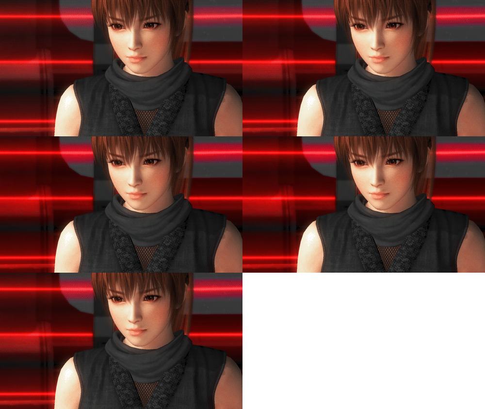
lol! Pai looks very excited. XD
David Gregg
Well-Known Member
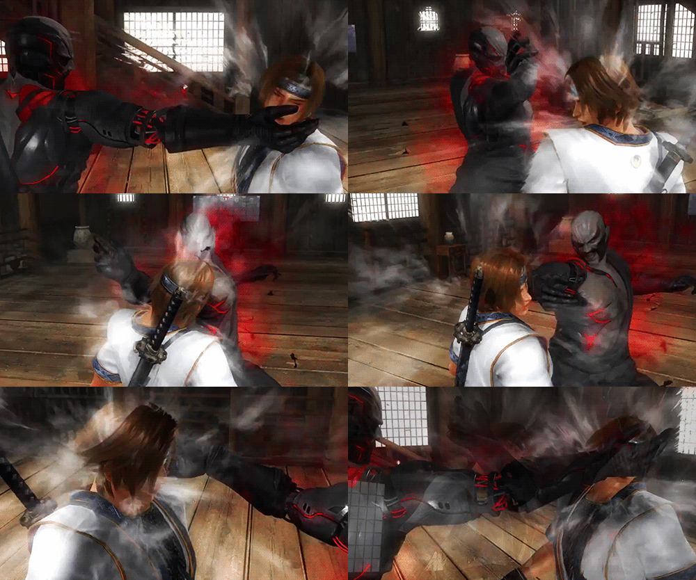
Dat gif quality tho...You're the best, Chapstick (and I mean that in the most awkward way possible). XD
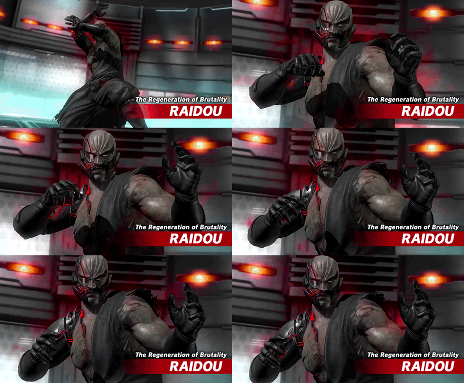
Another hilarious part on that GIF is to remind everyone on what Raidou's hand is made out of now.
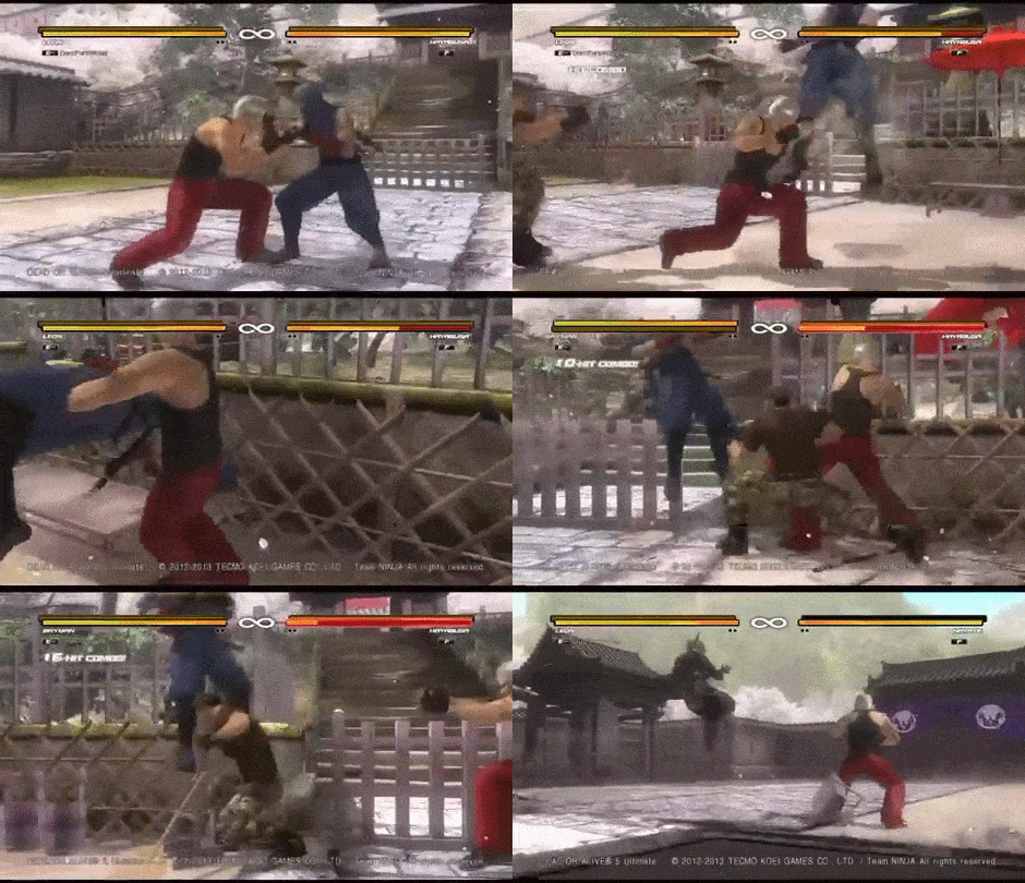
Hayate after:

Kronin
Well-Known Member
The background of this DOA1 stage looks more impressing, than the background textures of DOA5's Ends of the World. XD
I disagree, personally I love the End of the World stage even for the background XD
Off Topic:
However for fairness has to be said that the fate of DoA1 was the same of the passage from DoA4 to DoA5: when released on the arcade the original version of DoA1 used 3D models in background, something that was sacrificed in all the next conversion (DoA1 for Sega Saturn/ DoA1 for PSX/ DoA++ on arcade), with pre-rendered images used for the background in favor of an higher quality for the characters models (not sure if also the music quality was lost).
How it's said "History is repeating itself".
Here you can see a video of the original arcade version for DoA1:
Last edited:
I disagree, personally I love the End of the World stage even for the background XD
Don't make me do screenshots of the background of End of the World. XD The background icebergs are really just ugly low resolution textures. There's even one detail, where one mountain texture is just cut off. Looks really sloppy and weird.
DontForkWitMe
Well-Known Member
I think that happened to me once. Idk if I have a saved video about that. I gotta check my vids. LolFound out this bullshit a few minutes ago...
Pictured Mind
Well-Known Member
All about that tag life.


