The Art Style and Graphics Discussion

Tyaren

Well-Known Member
Standard Donor
Here's two examples of DOA's eye movement (requested by Tyaren)

Mn95hGN.gif

^my problem with his face is those lower eyelashes, they look odd especially since they're darker than his hair
gnB7fLm.gif

^sidenote I find Leifang's eyes to be the prettiest in the game dunno why everyone says she looks like a lizard

Aw...thanks so much! :3 They are great!
Though I could have sworn, the eye muscle twitch, that Hayabusa does in his intro, was a little bit more pronounced. Maybe it seems different, because you didn't use his Black Falcon costume, where there's even more focus on just the eyes. Shows, that Team Ninja has some amazing character artists though. They knew, most of Hayabusa's face was covered, so to convey some emotion or something interesting, they added this little detail.

Also Leifang's eyes are indeed very pretty. I actually think, she is one of the prettiest girls in DOA5. Only Kasumi comes before her imho.
 

UpSideDownGRUNT

Well-Known Member
Kasumi is cute, but Hitomi wins for me I like her baby blue eyes and brunettes though.

Hitomi paused at the right moment always looks sensual though lol, Busa's eye twitch is less prominant in the half masked/unmasked costumes dunno why.
 

Tyaren

Well-Known Member
Standard Donor
Busa's eye twitch is less prominant in the half masked/unmasked costumes dunno why.

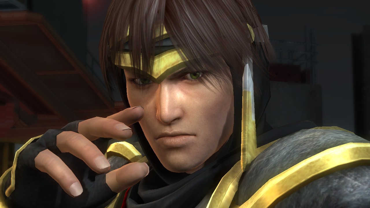
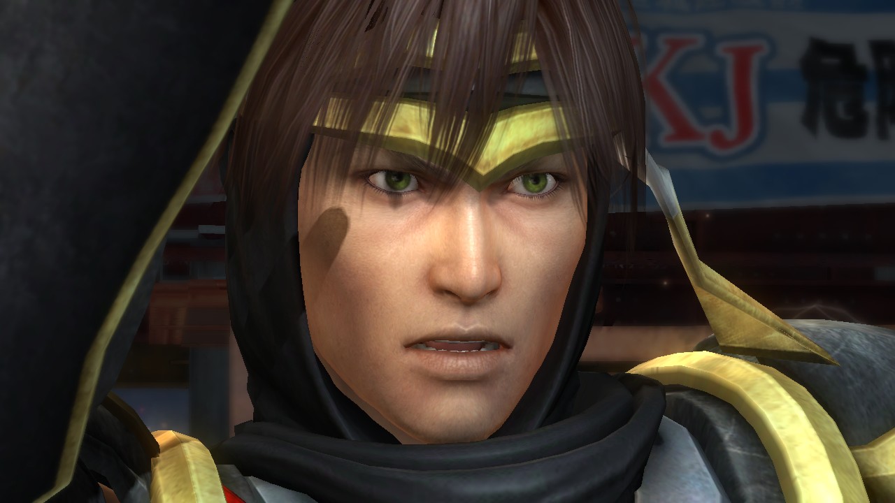
See, I knew I wasn't crazy. XD I'm pretty sure, the eye area in the Black Falcon costume has more polygons and bones, thus can be animated in more detail. Which is necessary there, so Hayabusa, completely covered up, can convey at least some emotions. Speakig of Hayabusa... I'm still mad he looks so...weird:

ryu_hayabusa_maskless_2__request__by_doafanboi-d6yidbn.jpg


ryu_hayabusa_maskless_3__request__by_doafanboi-d6yide5.jpg


ryu_hayabusa_maskless__request__by_doafanboi-d6yid6c.jpg


He's also in need of some @Chapstick. ;)
 

WisperG

Well-Known Member
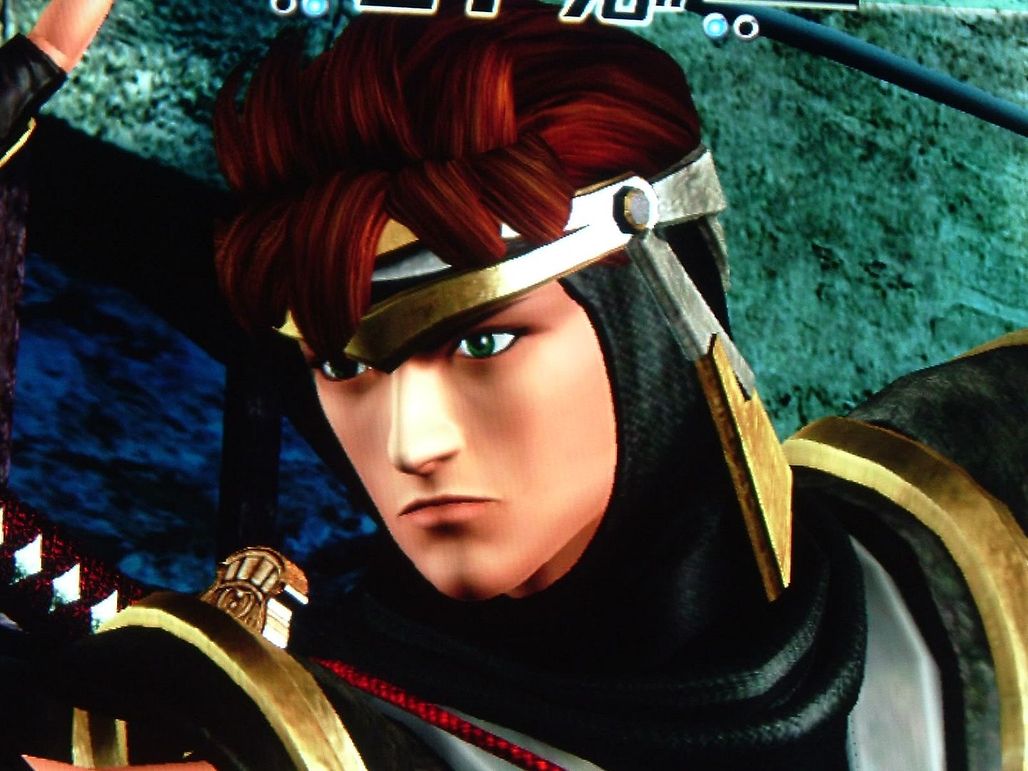
Right? He didn't make the transition from anime-doll to the current quasi-realistic style as well as some of the others did. I definitely think he suffered the most from the graphical jump.

He looks notably older and a bit too gruff now, whereas before he looked rather young and even had a slight bishonen quality to him.

ryuhayabusa.jpg

hayabusa_ryu_1357.jpg
 

Tyaren

Well-Known Member
Standard Donor
He looks like he's 40 now, whereas he's supposed to be 25. I get, that a super ninja has probably lotsa stress...but they definitely overdid the aging. Also as @WisperG said, he was supposed to be a bishounen/pretty boy before, similar to Hayate and now, additionally to being old, he also looks really...weird. I know, I'm repeating myself with this very vague statement, but I really don't know how to word it better. Something's wrong with his face. It's actually still handsomely and evenly cut...but something else makes Hayabusa look so unattractive. Lol, I wished, they'd kept his face covered in DOA5. ;)
 
Last edited:

Chapstick

Well-Known Member
See, I knew I wasn't crazy. XD I'm pretty sure, the eye area in the Black Falcon costume has more polygons and bones, thus can be animated in more detail. Which is necessary there, so Hayabusa, completely covered up, can convey at least some emotions. Speakig of Hayabusa... I'm still mad he looks so...weird:

ryu_hayabusa_maskless_2__request__by_doafanboi-d6yidbn.jpg


ryu_hayabusa_maskless_3__request__by_doafanboi-d6yide5.jpg


ryu_hayabusa_maskless__request__by_doafanboi-d6yid6c.jpg


He's also in need of some @Chapstick. ;)
I was thinking of doing him too but this time it will have to wait until next afternoon. He's definitely going to need more work than Eliot. << Starting with chapstick (as in lip balm lol) and under eye cream

Has anyone else taken a close look at Momiji's face? Hers looks lower quality than everyone else.
 

Chapstick

Well-Known Member
Finally got around to screenshotting theatrhythm, I really dig the chibi style they went with. Avid FF fans will recognize most if not all of these settings, characters, and enemies.

WVW69iU_OCQ8tXUhv8

WVW69iU_J0AcFIOCjz

WVW69iU_gDgM-w6BN-


WVW69iU_y4sweWQNcu

WVW69iU_x5YztEtFQx

WVW69iU_weo-wn5Pr4

WVW69iU_iK4DJGyM6x

WVW69iU_kccFczBiG5

WVW69iU_q-E0Yzz9ON

WVW69iU_JDYnIS1ljK

WVW69iU_0XQz5dT89S

WVW69iU_6Nc8zTFA9s

WVW69iU_ISkrohWzjI

WVW69iU_ugYyqnhsIh

WVW69iU_L0gzXFaoXJ

WVW69iU_15YFodGcSV

WVW69iVAPfcEnCbSh-

WVW69iVAL60ICg8lpY

WVW69iU_W7chhh_9CR

WVW69iU_NQc9CzqNzq

WVW69iU_PvM8hcr6tx

WVW69iU_TmYTUVFV_2

WVW69iU_c4U0TYvIzG

WVW69iU_-BsbrdaHhJ

WVW69iVADO8fU7q-3Q

WVW69iVARtM-Beg6bg

WVW69iVAWsoTNgKzN0

And my card just because ;)

WVW69iVAd1MpV5nPz9
 

Tyaren

Well-Known Member
Standard Donor

To be honest, his face seems a bit doughy now. :/

I tried something too. The changes are subtle, but if you, as Chapstick explained, open both pics as new browser tabs, and click back and forth between them, you will notice the difference.
new:
Hayabusanew.jpg


old:
Hayabusaold.jpg


I basically got rid of his hooded eyelid. I smoothed out his face with less deep folds/shadows, I slightly corrected his hook nose, shortened and rounded his chin and gave his lips a bit more contrast to the rest of his skin and last but not least I did something to his weird angular cupid's bow. :)
 
Last edited:

Chapstick

Well-Known Member
To be honest, his face seems a bit doughy now. :/

I tried something too. The changes are subtle, but if you, as Chapstick explained, open both pics as new browser tabs, and click back and forth between them, you will notice the difference.

new:
View attachment 13207

old:
View attachment 13208

I basically got rid of his hooded eyelid. I smoothed out his face with less deep folds/shadows, I slightly corrected his hook nose, shortened and rounded his chin and gave his lips a bit more contrast to the rest of his skin and last but not least I did something to his weird angular cupid's bow. :)
Yeah it was the left edge of his face I should have left alone after softening out his cheeks. I spent like 45 minutes warping and messing around with layers and was like "ugh whatever" lol
 

KasumiLover

SovereignKnight_
Premium Donor
Seriously, where were you guys at when they were making Ryu for DOA5? You guys could've saved him from having a an old looking face. :-0
 

Jadeinchains

Well-Known Member
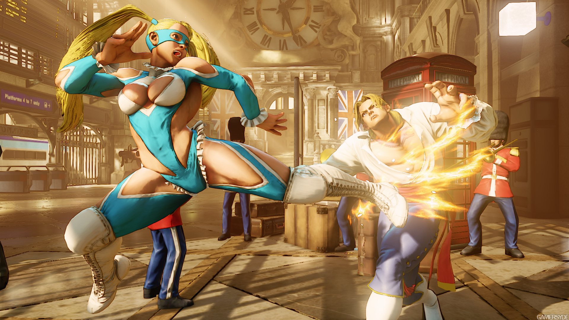
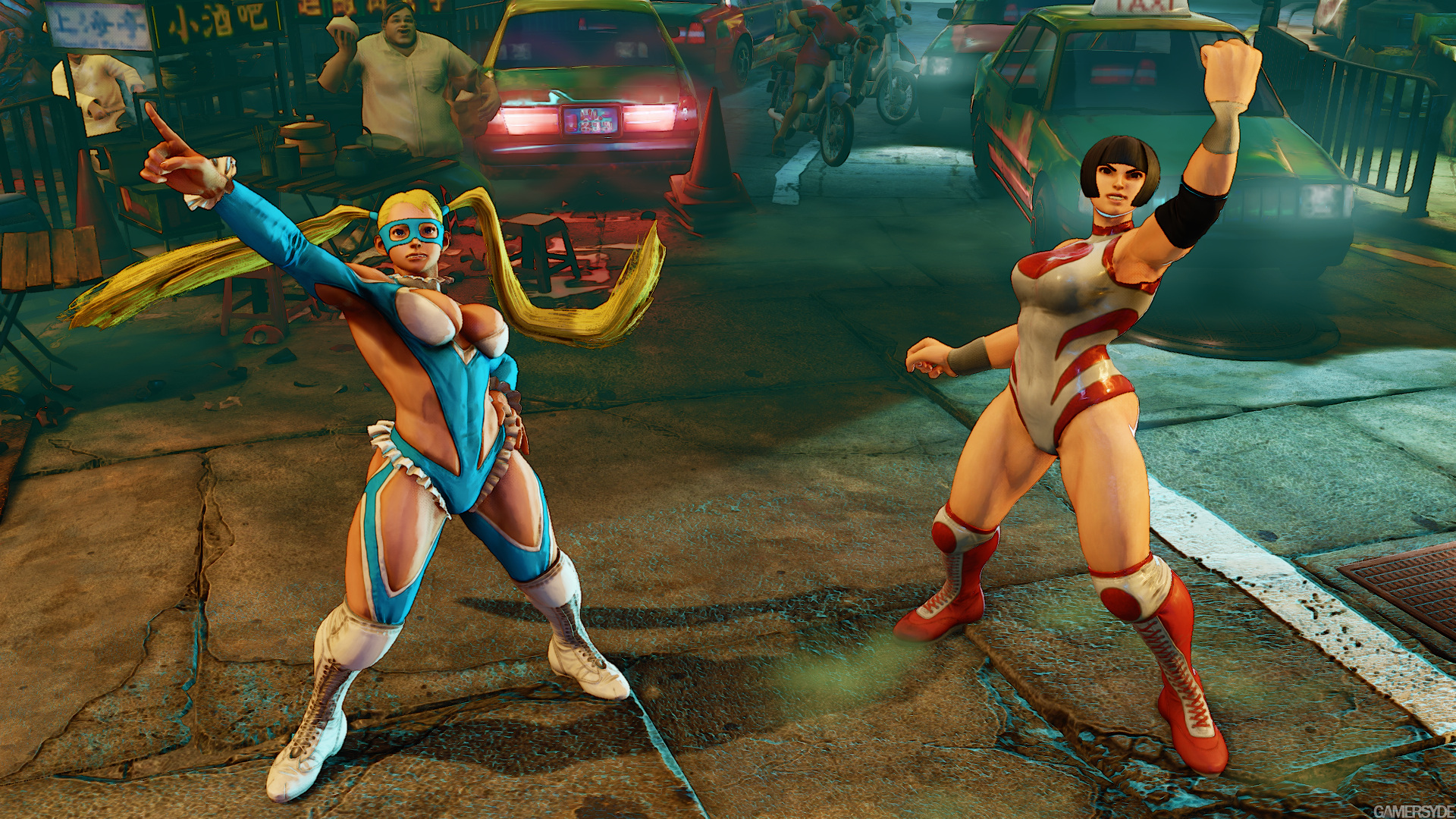
This is one of the ugliest (professional) character designs, that I have ever seen... x__X'

image_street_fighter_v-29401-3120_0012.jpg


image_street_fighter_v-29401-3120_0004.jpg


image_street_fighter_v-29401-3120_0009.jpg


...

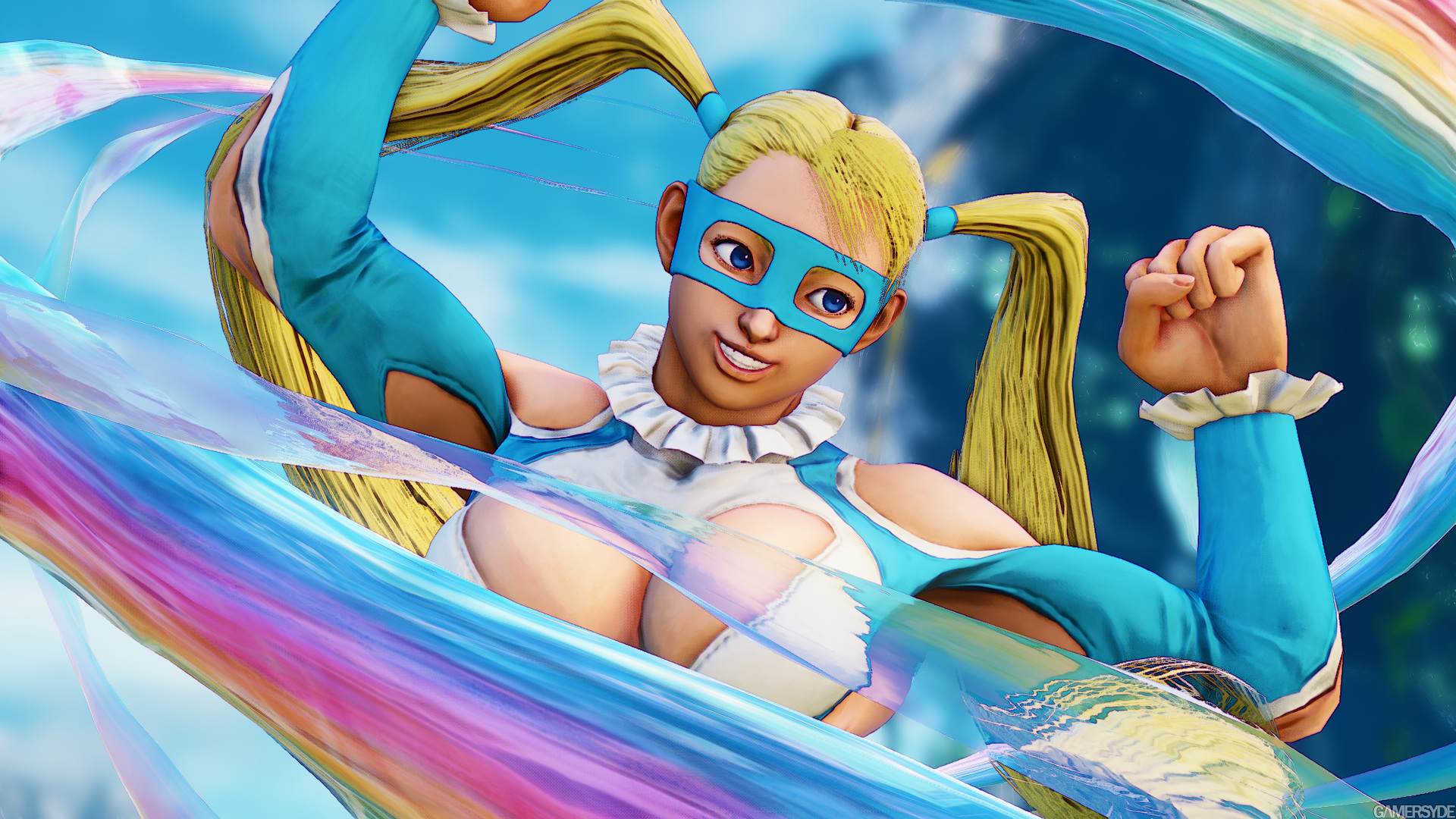
I saw that R Mika had been revealed and yeah the outfit sure is something. I don't even hate it because its skimpy because skimpy outfits are fine. I hate it because it just is simply hideous and SF overly muscular fighters certainly don't help.

At least they aren't censoring themselves for political correctness though even if the outfit is ugly.
 

Juihau

Well-Known Member
I just noticed something.
58550d1226.png

What is this face? What kind of person makes that face after getting kicked in the gut?
 

Juihau

Well-Known Member
Oh god, that's Vega? I didn't even realize. Haven't been following SFV. He looks like a freaking 10 year old on steroids. I mean, yeah, youth and beauty are frequently related, but the most beautiful man on Earth really shouldn't have such a babyface.
 

WisperG

Well-Known Member
I've never loved the light blue/white color scheme (which alt colors easily fix), but I thought she looked fine. Not great, but perfectly fine. Pretty much identical to her original appearance, aside from some costume tweaks and the fact that she's thicker and more muscular now. The character model could use some work though. Textures and shading are kinda bleh up close.

I guess she does kinda suffer from Honoka's problem though, where they made her "chunkier" yet her face is still perfectly thin.
 
Last edited:
ALL DOA6 DOA5 DOA4 DOA3 DOA2U DOAD
Top