You are using an out of date browser. It may not display this or other websites correctly.
You should upgrade or use an alternative browser.
You should upgrade or use an alternative browser.
Halloween Designer Challenge 2015
- Thread starter Tyaren
- Start date
Have I got a design for you Lol
lizardmech
Member
I don't know what to make, halloween is hard. I scribbled some aircraft themed nyotengu but I'm not sure if I like it enough to make it properly.


I really like that Eliot one, but I wish people would stop putting big weapons on the back of characters just for deseign. it looks tacky as in literally tacked on and just increases the likley hood of clipping
Darkslay
Well-Known Member
So, i've been thinking of doing Double Dragon inspired costumes for both Jacky and Lee, you guys think its a good idea? or would there be some kind of issue?
Here's some artwork of Billy in Double Dragon Neon. (i mean, look at the guy, he literally looks like Jacky lol)

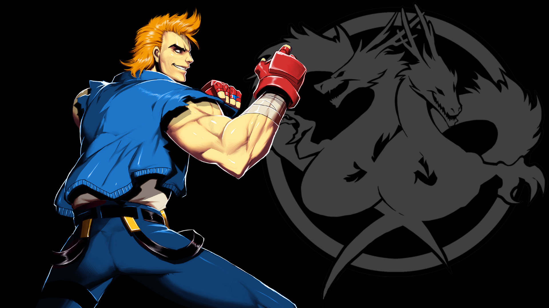
Here's some artwork of Billy in Double Dragon Neon. (i mean, look at the guy, he literally looks like Jacky lol)


Kronin
Well-Known Member
If you change enough it there shouldn't be problems, the same TN adopted many outfits that even if different are easily recognizable as inspired to other popular characters or works.
The real problem is to include changes that can make of these outfits Halloween ones, so something able to change the appearence of them from ordainry/fighters ones to something dark. Remember that when having to decide what to make DLC in the previous contest, TN appeared to give the priority to what could be seen as actual Halloween/Masked outfits.
The real problem is to include changes that can make of these outfits Halloween ones, so something able to change the appearence of them from ordainry/fighters ones to something dark. Remember that when having to decide what to make DLC in the previous contest, TN appeared to give the priority to what could be seen as actual Halloween/Masked outfits.
Last edited:
Darkslay
Well-Known Member
If you change enough it there shouldn't be problems, the same TN adopted many outfits that even if different are easily recognizable as inspired to other popular characters or works.
The real problem is to include changes that can make of these outfits Halloween ones, so something able to change the anture of them from ordainry/fighters ones to something dark. Remember that when having to decide what to make DLC, TN appeared to give the priority to what could be seen as actual Halloween/Masked outfits in the previous contest.
Hmm i see, well, the secondary theme i had tought of was "80s style beat-em up" but as you say, it seems they favor dark themes more than anything, still, last year they gave them sidekick costumes so i think i'll try and see if it works out, thanks.
Candy Dragon
Well-Known Member
I really hope, this Japanese artist will finally submit her two Alice in Wonderland designs for Eliot and Marie Rose:
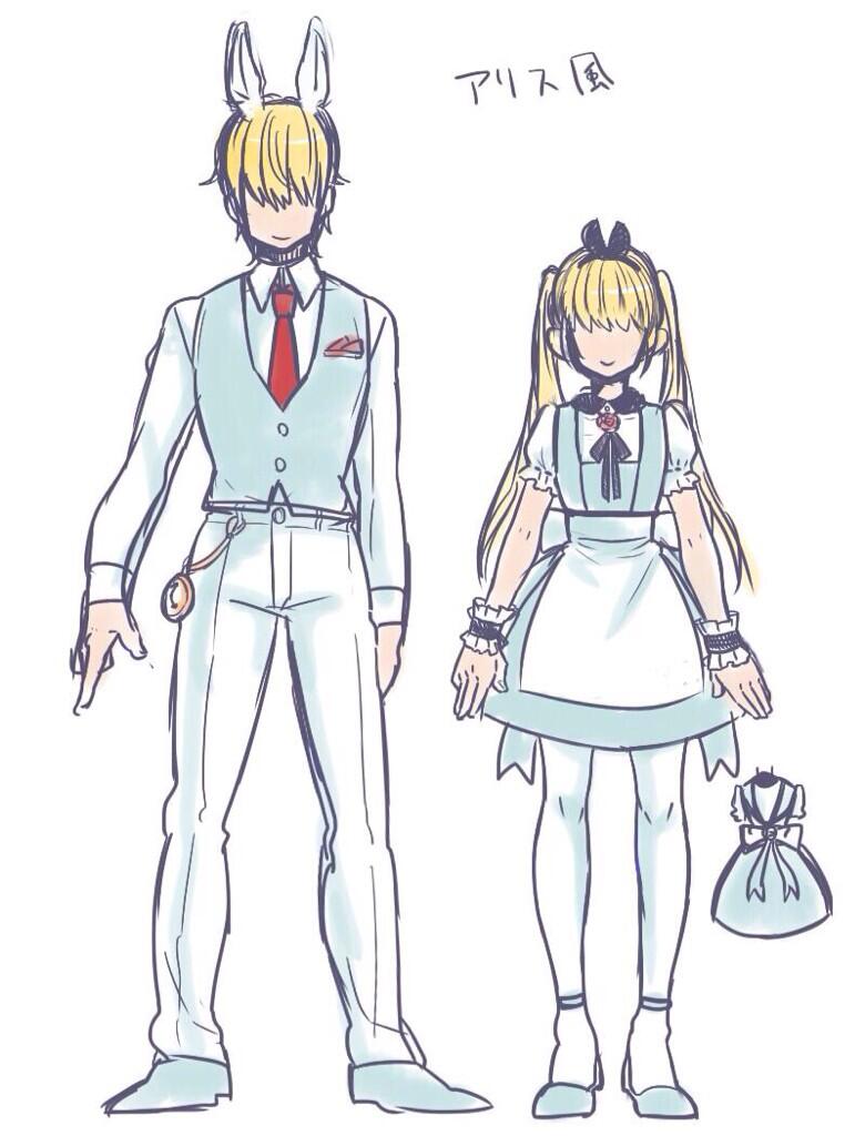
Cleaner version of Eliot, made for the first costume contest:
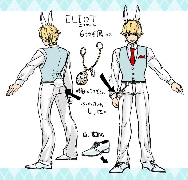
@EMPEROR_COW, pleeeeaaase beg her, to submit these two designs. >o<

Cleaner version of Eliot, made for the first costume contest:

@EMPEROR_COW, pleeeeaaase beg her, to submit these two designs. >o<
shes gonna .. actually she was planning on a 3rd one .. Brad as the mad hatter ... i saw the sketch it looks greatI really hope, this Japanese artist will finally submit her two Alice in Wonderland designs for Eliot and Marie Rose:

Cleaner version of Eliot, made for the first costume contest:

@EMPEROR_COW, pleeeeaaase beg her, to submit these two designs. >o<
shes gonna .. actually she was planning on a 3rd one .. Brad as the mad hatter ... i saw the sketch it looks great
OMG, OMG, OMG!! That would be SO awesome!
nothingtosee
Active Member
Id love that as well i seriously hope the artist submits those three they would be awesome as a set considering Nyo is already the queen of hearts.OMG, OMG, OMG!! That would be SO awesome!Can't wait to see them!
axouel2009
Well-Known Member
well well well ! here my fist costume ! 

I'll make some "DLC packs - wanna be " lol and the first one is "Bad Werstler" withe a little sorty for fun lol. Daddy and a new friend coming soon !

I'll make some "DLC packs - wanna be " lol and the first one is "Bad Werstler" withe a little sorty for fun lol. Daddy and a new friend coming soon !
Kronin
Well-Known Member
I love that design @axouel2009, nice work!
@Kasumilover98 If you want my opinion I think that the big problem of the drawing is it being not clear, this cause the use of the lowercase letter and of the poor visibility of them. Overall the same drawing of the desig is too much little and would need definitely to be colored for a better outcome that allow you to make more clear your idea and save useless text about what kind of color use. Believe me, leaving the design in this way many people wouldn't care neither to read or analyze it, just because it's necessary a further effort compared to the usual submitted entries.
If you have time I suggest you to draw your design again on completely white paper making the figure pretty big (don't worry for the outcome or the proporitons, just highly increase the size of everything). Color it and add a more bigger text wrote in block letters, better if using a pen (one with gel ink it would be perfect for the visibility, however there is the risk of smudges; alternatively you can simply add in a second time the text on your photo even simply using paint).
Of course you are free to do as you wish and this is just a suggestion, but like Team NINJA says there is no need to rush with still all the month of May available. So take all the time that you need for your work, there is no need to complete it soon =)
Thanks for the critique! The drawing is still a work in progress, so I have to add the gold and green into the areas needed. I'll also trace over the lettering to make it more legible.I love that design @axouel2009, nice work!
@Kasumilover98 If you want my opinion I think that the big problem of the drawing is it being not clear, this cause the use of the lowercase letter and of the poor visibility of them. Overall the same drawing of the desig is too much little and would need definitely to be colored for a better outcome that allow you to make more clear your idea and save useless text about what kind of color use. Believe me, leaving the design in this way many people wouldn't care neither to read or analyze it, just because it's necessary a further effort compared to the usual submitted entries.
If you have time I suggest you to draw your design again on completely white paper making the figure pretty big (don't worry for the outcome or the proporitons, just highly increase the size of everything). Color it and add a more bigger text wrote in block letters, better if using a pen (one with gel ink it would be perfect for the visibility, however there is the risk of smudges; alternatively you can simply add in a second time the text on your photo even simply using paint).
Of course you are free to do as you wish and this is just a suggestion, but like Team NINJA says there is no need to rush with still all the month of May available. So take all the time that you need for your work, there is no need to complete it soon =)
Squizzo
Well-Known Member
Lisa as La Calavera Catrina
Facebook: https://www.facebook.com/photo.php?fbid=1594385044173441&set=o.126851554085605&type=1&theater
Twitter: https://twitter.com/Squizz0z/status/595673369804152832

Facebook: https://www.facebook.com/photo.php?fbid=1594385044173441&set=o.126851554085605&type=1&theater
Twitter: https://twitter.com/Squizz0z/status/595673369804152832

I.....REALLY love this! The dress, shoes, and arm wear go together really well, and the Rose in her hair is the cherry on top!Lisa as La Calavera Catrina
Facebook: https://www.facebook.com/photo.php?fbid=1594385044173441&set=o.126851554085605&type=1&theater
Twitter: https://twitter.com/Squizz0z/status/595673369804152832

Chapstick
Well-Known Member
Tina as a guest character in Mortal Kombatwell well well ! here my fist costume !

I'll make some "DLC packs - wanna be " lol and the first one is "Bad Werstler" withe a little sorty for fun lol. Daddy and a new friend coming soon !
Well shit, this is a lot more halloween than my entry's gonna be
