You are using an out of date browser. It may not display this or other websites correctly.
You should upgrade or use an alternative browser.
You should upgrade or use an alternative browser.
Wild unedited screenshots of Last Round appeared!
- Thread starter Tyaren
- Start date
I have a picture I took a while ago of the crowd on that stage-
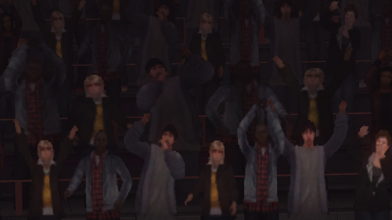
If you wanna see REALLY bad, look at the crowd in Tiger Show. I had a pic of that somewhere but can't find it.
LMFAO!!!!!!Oh sh*t it's Eminem!!
I noticed how bad the crowd is in 5+. After that the only crowd worth looking at is the one in Fighting Entertainment.
Also PS4 records things in 720P and 30fps and compresses screenshots a bit. It won't look better than previous consoles if you show off from a PS4 recording aside from particle/lighting changes.
Also PS4 records things in 720P and 30fps and compresses screenshots a bit. It won't look better than previous consoles if you show off from a PS4 recording aside from particle/lighting changes.
Argentus
Well-Known Member
See what you don't understand, is that's not a crowd of people, that's actually just like 3 ninjas running around with afterimages. They's why they are so blurry!I have a picture I took a while ago of the crowd on that stage-

If you wanna see REALLY bad, look at the crowd in Tiger Show. I had a pic of that somewhere but can't find it.

But seriously I can't see a difference between ps3 and ps4 screenshots.
Eminem clones are taking over DOA now...
And that looks like something out of the original Sims from 2000 xD
I originally read that as original Slims from 2000.
synce
Well-Known Member
It was kind of tough finding a Christie video that didn't involve zoom ins on her crotch but here's a quick and dirty comparison
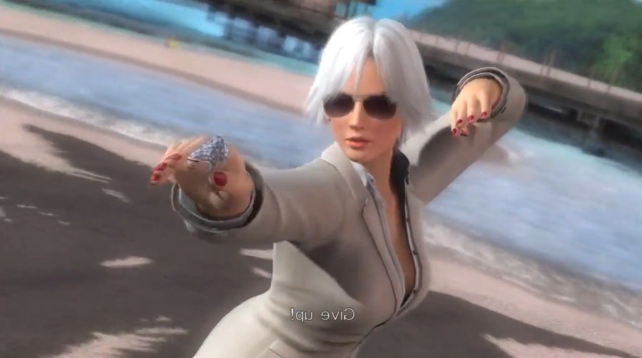
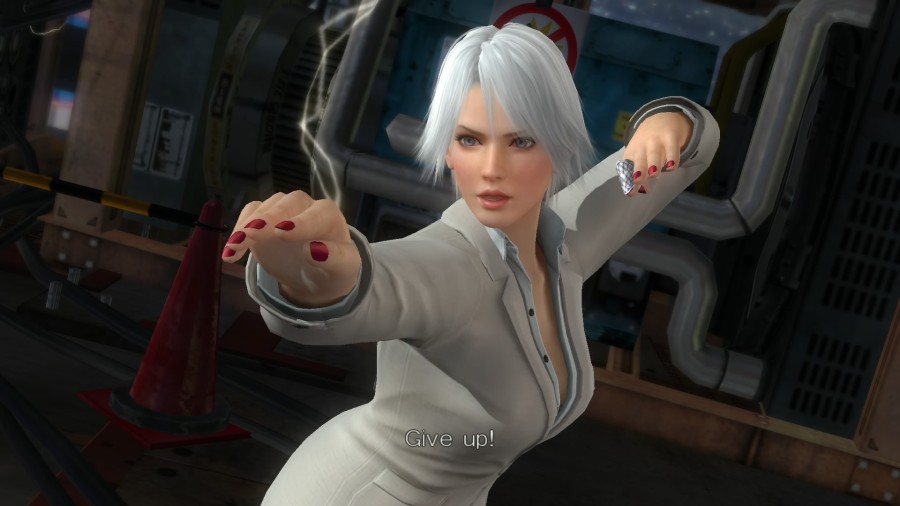
I think all they did was make the core shadows a little brighter. The prebaked lighting is exactly the same across two entirely different stages AND consoles
I think all they did was make the core shadows a little brighter. The prebaked lighting is exactly the same across two entirely different stages AND consoles
Rikuto
P-P-P-P-P-P-POWER!
Team Ninja knows how to make a decent looking crowd, but when they increased the detail on the player models they had to make sacrifices on the stage detail.
Were this all done on the current gen consoles from the start, such limitations wouldn't really be all that imposing. Alas, not.
Were this all done on the current gen consoles from the start, such limitations wouldn't really be all that imposing. Alas, not.
I made a as close as possible comparison shot.  (Unfortunately I don't own Jacky's Halloween costume.)
Last Round:

DOA5U:

Open both images in new tabs in your browser and click back and forth to see the differences best.
(To match sizes, I reduced Last Round's shot in size, not DOA5U's. Because I always find comparisons highly unfair, where 720p is significantly blown up. Making 1080p smaller though, to match the 720p version, doesn't hurt the overall image quality.)
Last Round:

DOA5U:

Open both images in new tabs in your browser and click back and forth to see the differences best.
(To match sizes, I reduced Last Round's shot in size, not DOA5U's. Because I always find comparisons highly unfair, where 720p is significantly blown up. Making 1080p smaller though, to match the 720p version, doesn't hurt the overall image quality.)
The lighting engine works overall better in Last Round. DOA5U is partly overexposed (Helena's shoulder and thigh) and has a yellowish and reddish hue, whereas LR seems much more natural. Shadows and self-shadowing are much cleaner. The aliasing seems to be indeed reduced and there is some sort of depth of field blurring in the background (no more jaggies on the wire frames). What's not so nice, is the blurring of textures on the more distant floor areas. :/you can see the body more shiner and little jagged edge on the rope and costume a bit smoother on LR
anti-alising?
Last edited:
d3v
Well-Known Member
Let's face it, the crowd in stages like those is one of the least important things when it comes to a fighting game, especially since you never really go near them. For stuff like people and animals in stages like Home and the circus stage, you see that they're fully rendered in 3D because they go closer to the action.
More likely a result of the depth of field filter.^ hmm like the graphic engine exhausted it resources until it forgets the background
Last edited:
synce
Well-Known Member
Actually it has nothing to do with DOF or anything like that... the next gen version lacks anisotropic filtering, which is shocking to me. Shouldn't be a problem on the PC version assuming it has graphics options
Other than that it looks like they reduced the bloom effects, thank god One of my least favorite features of DOA5 (and 2U)
Other than that it looks like they reduced the bloom effects, thank god
NukNuks
Well-Known Member
In E3 of this year, they will probably announce a new game that will keep them busy (either a NG or DOAX3 or a Virtua Fighter collaboration). A DOAX3 on PS4 with tons of bikini DLCs will last 2 years at best. Then DOA6 will be announced in E3 2017 or TGS 2017 for 2018 at worst. When DOA was still alive, there was a 3 year gap maximum (DOA3 - Q4 2001, DOAU - Q4 2004, DOA4 - Q4 2005).
Just my predictions of course.
As much as I would love to see it happen, I personally asked Tom Lee myself during dinner during SCR last year if there was a ever a possibility for some sort of DOAxVF game...he said said no. Doesn't make sense financially :/
gamemaster14
Active Member
I would go as far to say the people in the XOctagon Stage in doa3 looked better, atleast they were 3d models.I have a picture I took a while ago of the crowd on that stage-

If you wanna see REALLY bad, look at the crowd in Tiger Show. I had a pic of that somewhere but can't find it.
synce
Well-Known Member
I would go even farther and say DOA3 straight up looks better than any fighting game today... Too many people just count pixels and overlook art direction.
BTW I tried searching for DOA3 beach screenshots, then DOA5 beach screenshots to do a quick comparison but couldn't find any gameplay screens from the DOA5 search. I just found that amusing
BTW I tried searching for DOA3 beach screenshots, then DOA5 beach screenshots to do a quick comparison but couldn't find any gameplay screens from the DOA5 search. I just found that amusing
gamemaster14
Active Member
The whole thing were people compare doa5 last round to the previous doa games without realizing its an updated version for some reason makes me think of that target paper showing a wii u game pad with an original wii console.
I would go even farther and say DOA3 straight up looks better than any fighting game today... Too many people just count pixels and overlook art direction.
BTW I tried searching for DOA3 beach screenshots, then DOA5 beach screenshots to do a quick comparison but couldn't find any gameplay screens from the DOA5 search. I just found that amusing


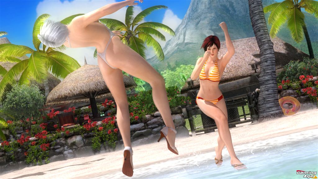


It's actually much harder to find decent pictures of DOA3's beach stage. I searched for that amazing sunset view with the flock of gulls circling in the sky, but couldn't find a decent quality picture.
Last edited:
