Characters Do you miss the anime-styled pre-DOA5 games had?

KasumiLover

SovereignKnight_
Premium Donor
Actually, I remember reading on Hardcore Gaming 101 that 2/2H, 3, 2U and 4 curiously all use different models. Mind you, similar looking, but different.
Games prior to DOA5 that share models apparently are 2U and Xtreme 1, and then 4 and Xtreme 2.
A comparison with HQ screens would be apt for this research though, lol.

(Even in DOAD they made new models, I think. )

My only issue with the realistic style in 5 was the shoddy modeling of some things, the mistreatment of dudes, the dull colors, and looking back on it... Well, not much else, I think.
I think they took inspiration from Omega Force's games, and it wouldn't surprise me if the teams shared artists. Though I wish they took the extra step to make it look a tad more anime like Samurai Warriors does.
Nah they may be different but they're still all the same, only difference is hair models and body build for the guys. Dimensions uses the same modified version models of the 2U models(You can tell since Kasumi and Leifang and a few others use their old 2U hair modelsl and it uses the DOA4 models for the new characters but downgraded like Kokoro has her hair tied and Lisa looks worse and Eliot looks almost different.

I don't want an anime look for DOA6 but I still say they should make the game look more like Dissidia FF NT, it's the best looking game art style and design wise imo. It looks realistic while still keeping a manga like approach similar to the original FF designs
 

Tyaren

Well-Known Member
Standard Donor
Actually, I remember reading on Hardcore Gaming 101 that 2/2H, 3, 2U and 4 curiously all use different models. Mind you, similar looking, but different.

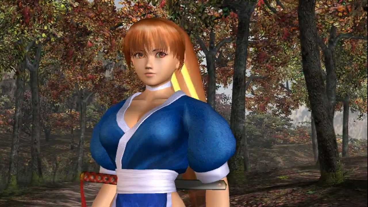
That is the case, don't let anyone tell you otherwise. Each game after DOA2 introduced new, improved models with updated polygon count and updated textures and shaders. Similarly to DOA5-DOA6 the models look the same at a first glance, because they share the same stylistic, but if you look closer and compare the polygon structures and textures you can clearly see the difference. The jump in quality from Kasumi in her classic blue garb in DOA3 to Kasumi in her classic blue garb in DOA2U was immense.

maxresdefault.jpg


f839faa1792c765940c60319340ea81e.jpg


They look the same on the surface, same costume, same stylistic, but the models were still different and greatly improved each iteration.
 

Camel with 2 thumbs

Well-Known Member
I feel like 5, and soon 6, are at a pretty good place as far as character aesthetic is concerned. I agree with @KasumiLover69 in that the hair is definitely a glaring weakness however. I appreciate the progression of the graphics in DOA as the early games (Aside from PS1 because every game that was 3D looks terrible to me from back then) looked wide eyed and young. As the series grew the characters (And graphics) had to mature a bit. I feel like 6 is the natural evolution of this. They could have reinvented the wheel and tried to go with a totally different aesthetic from 5 but it looks like 6 is occurring directly after 5 with very minimal time jump so I don't mind the characters looking close/exactly like they do in 5. Facially and thematically you can tell exactly who you're looking at in DOA 2x3 if you played 5. I feel like they've been very loyal to every character's identity and facial features. (Except Hayabusa who they gave a butter face and fortunately in 6 Jann Lee found his nipples.)

But they really need to do something with the hair. It really has lost it's charm.
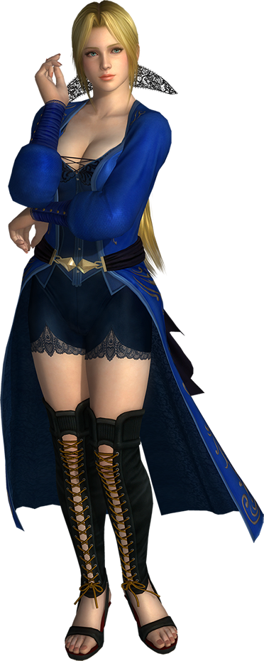
269845-helena.jpg
latest


I mean come on lmao

Back when helena styled her hair with the strongest of hair gels, now it's all matted down and boring :(
 

KasumiLover

SovereignKnight_
Premium Donor
The models weren't that "greatly" improved nor that different but whatever XD

DOA3 and DOA4 did have some technical feats I liked tho like they had relflections in the waters and flooring but idk if that's possible with DOA6, DOA5LR couldn't do that since that would mean constant adding of data and other stuff to reflect all the 500+ outfits and hairstyles and that sounds pretty intimidating from a development stand point
 

Tyaren

Well-Known Member
Standard Donor
Lol...in what year are we? By now modern games use either cube map reflections or screen space reflections. Cube maps are less taxing, the problem is they will only reflect a static environment and they won't reflect the characters.
Screen space reflections are a lot more taxing, they do however reflect the environment and the characters in movement. They do come with some errors and imprecisions though. The more precise and high res they are, the more taxing.
The old practice of building a complete mirrored environment and characters (and every costume) and faking a reflection isn't really applied anymore. That would be way to taxing with how complex environments and characters have become, even if they are rendered less detailed in the mirrored version
So if they implement reflections in DOA6, they will either use cube maps or screen space reflections. They'll likely go with the former, at least on consoles, like Tekken 7 did with the reflections in the Duomo stage. On PC and Xbox One X they might include screen space reflections though. That depends on how willing Team Ninja is to actually polish and improve the PC version or if they want to go for visual parity with the consoles.

I have been thinking about getting the Xbox One X for DOA6. I'll wait to see how big the improvement is over the PS4 Pro though.
Can anybody tell me how the D-pad is on Xbox One? I hated how sluggish it was on Xbox360.
 

Shirataki Tsume

Well-Known Member
DOA3 had that grayish/off-color ambience in it. DOA4 looked vibrant, and being able to change the contrast was a good feature. DOA5 had that slight bloom in it. I mean when you position your character towards the light, there's a little glow at the character. It's not very noticeable, but you'll see it when you pay attention to it. DOA5 doesn't look as vibrant as as DOA4, but it still has more color depth than DOA2U.

I have been thinking about getting the Xbox One X for DOA6. I'll wait to see how big the improvement is over the PS4 Pro though.
Can anybody tell me how the D-pad is on Xbox One? I hated how sluggish it was on Xbox360.
If you didn't like the Xbox 360 controller, you'll probably dislike the Xbox One controller more. The Xbox 360 controller felt more comfortable and both controllers have pain inducing D-pads. Well, it depends on how you play it. As someone like me who spends 2 hours of performing difficult moves and combos in training mode, I end up getting calluses after because Xbox's D-pad feels like tapping on a stone.
 
Last edited:

Juihau

Well-Known Member
DoA4 was really the only one that was super colorful. DoA3 was a very dark theme, and DoA2 kind of met in the middle.
I kinda didn't like the 5U versions of DoA3 stages for basically this reason. In 3, the stages were pretty subdued with their colors, but in 5U, it was like they cranked the saturation wayyy up. Like, I get they were trying to backpedal a bit with how dark and gritty they made most stages in 5, but they went a bit too far in the opposite direction.

Also the fact that, in Lost World, the cliff you just fell from mysteriously vanishes in 5U, when it actually stayed in the background in 3. I get that it's a pretty dumb thing to dislike, but it kind of changes the whole feel of the stage. It makes it seem more like a series of floating islands, rather than insanely tall plateaus.
 

Hayabusiness

Well-Known Member
The models weren't that "greatly" improved nor that different but whatever XD

More polygons? Better textures? Better lightning?o_O Just in that pic, a look at Kasumi' sword should tell you everything, or her dress, or her hair. The only thing staying consistent is art style and this is why you won't notice improvement at glance, and also why DOA5 looks like such a huge improvement compared to the gaps between 2, 2H, 3, 2U and 4(and in a way it is a huge improvement, simply based on the fact that characters can show emotion much better than before, at least IMO).

If you play these games back to back and look at the models you'll notice that it's true, they're all different, which is quite interesting if anything. You don't have to like it or prefer it over DOA5, neither pretend there was no graphical improvement at all and that they copy pasted everything, it's just that they *did* make new models each time, and it's an interesting insight on how Team Ninja handled development.

I also believed the games used the same models with tweaks before playing them and seeing them in action... Man, I don't know if their artists had to be praised for being so consistent or scolded for making things seemingly samey.
 

Leifasumi

Active Member
DoA4 was really the only one that was super colorful. DoA3 was a very dark theme, and DoA2 kind of met in the middle.

DOAU2 was very colorful imo (Look at my avatar). Kasumi's old bright orange hair alone had more colors than DOA5 lol
 

KasumiLover

SovereignKnight_
Premium Donor
More polygons? Better textures? Better lightning?o_O Just in that pic, a look at Kasumi' sword should tell you everything, or her dress, or her hair. The only thing staying consistent is art style and this is why you won't notice improvement at glance, and also why DOA5 looks like such a huge improvement compared to the gaps between 2, 2H, 3, 2U and 4(and in a way it is a huge improvement, simply based on the fact that characters can show emotion much better than before, at least IMO).

If you play these games back to back and look at the models you'll notice that it's true, they're all different, which is quite interesting if anything. You don't have to like it or prefer it over DOA5, neither pretend there was no graphical improvement at all and that they copy pasted everything, it's just that they *did* make new models each time, and it's an interesting insight on how Team Ninja handled development.

I also believed the games used the same models with tweaks before playing them and seeing them in action... Man, I don't know if their artists had to be praised for being so consistent or scolded for making things seemingly samey.
More polygons is a given since they'd just look jaggy and outdated on higher end software. Textures and lighting may have better improvement but overall nothing was "greatly" improved or different. The game has looked the same from DOA3 all the way to DOA4, the only difference is changing a few textures and a few lightings and fixing whatever textures they knew they couldn't get away with. But if you think the game was greatly improved all because of some extra polys an' all 'at then that's when I have to look at you strange. The only time the graphics were improved greatly was in DOA5 where everything was really improved and overhauled, models weren't reused, assets weren't reused and they made everything actually look different and fresh. DOA 2 to 4 may have "made" new models but they basically reused the same old tired art style and hardly made any new changes besides body structure and whatever other minimal changes they did

I own all the DOA games besides the Xtreme entries so I first hand have seen the models up close and like I said theyre all pretty much the same, especially 2U and DOA4 which is almost like playing the same game. The major improvements honestly really stopped after DOA2 and DOA3. That's when the game seemed to have gotten comfortable and decided there wasn't much to improve and change, so they only adjusted small things and call it a day. Soul Calibur 4 & 5 and Tekken 4 & 5 did this as well, it's honestly nothing new when game devs do this when theyre content with their game's look
 

P2p1mbs

Well-Known Member
I once asked if they should add the option for us to let us switch to the old character designs but no one really cared. I'm now used to the current style and I kinda still would want to see the old style but am fine with just replaying the older games for that.
 

Hayabusiness

Well-Known Member
More polygons is a given since they'd just look jaggy and outdated on higher end software. Textures and lighting may have better improvement but overall nothing was "greatly" improved or different. The game has looked the same from DOA3 all the way to DOA4, the only difference is changing a few textures and a few lightings and fixing whatever textures they knew they couldn't get away with. But if you think the game was greatly improved all because of some extra polys an' all 'at then that's when I have to look at you strange. The only time the graphics were improved greatly was in DOA5 where everything was really improved and overhauled, models weren't reused, assets weren't reused and they made everything actually look different and fresh. DOA 2 to 4 may have "made" new models but they basically reused the same old tired art style and hardly made any new changes besides body structure and whatever other minimal changes they did

I own all the DOA games besides the Xtreme entries so I first hand have seen the models up close and like I said theyre all pretty much the same, especially 2U and DOA4 which is almost like playing the same game. The major improvements honestly really stopped after DOA2 and DOA3. That's when the game seemed to have gotten comfortable and decided there wasn't much to improve and change, so they only adjusted small things and call it a day. Soul Calibur 4 & 5 and Tekken 4 & 5 did this as well, it's honestly nothing new when game devs do this when theyre content with their game's look

I'm not talking about art style. The art style for 2 to 4 is the same. I'm talking about polygons and textures.
This is not something to get argumentative over. The models got remade from scratch and each time they looked similar but improved graphically, but art style wise they remained the same, hence why it doesn't feel like it improved in that regard.

I prefer 6's art style, but I can't deny each game from 2 to 4 improved GRAPHICALLY. It's a great improvement in some cases (2 to 3, 3 to 2U), it's a minor one in others (2U to 4), and overall it had a total of 0 changes to its art style. That's all.
 

TheDragonAwakens

Well-Known Member
Probably an unpopular opinion, but I actually heavily dislike the bright and colourful tone in DOA4 (and now DOA6) and actually prefer the DOA5/DOA3 darker and grittier colours. Too much light and bright colours will give me a headache sometimes. Still, I feel that DOA2U balanced out the colour tones well.

That being said, I don't miss the anime artsyle, though there are characters I feel that looked better with their anime artsyle.
 

KasumiLover

SovereignKnight_
Premium Donor
I'm not talking about art style. The art style for 2 to 4 is the same. I'm talking about polygons and textures.
This is not something to get argumentative over. The models got remade from scratch and each time they looked similar but improved graphically, but art style wise they remained the same, hence why it doesn't feel like it improved in that regard.

I prefer 6's art style, but I can't deny each game from 2 to 4 improved GRAPHICALLY. It's a great improvement in some cases (2 to 3, 3 to 2U), it's a minor one in others (2U to 4), and overall it had a total of 0 changes to its art style. That's all.
Im not arguing tho, I said before all this that the game didn't really change much and then someone disagreed indirectly and I did the same. Even graphically it didn't change much, yes textures got better but alot of assets were reused when these models were "remade from scratch" which I don't see besides maybe the hair models and surfaces getting better.

If they did use new models that's fine, I'm just saying the graphics didn't greatly improve all that much, it was below average at best, but Itagaki was probably content with how his vision of the game looked so that's probably why it always wound up looking the same bar some improvements as the graphic capabilities went up
 

Tyaren

Well-Known Member
Standard Donor
I'm not talking about art style. The art style for 2 to 4 is the same. I'm talking about polygons and textures.
This is not something to get argumentative over. The models got remade from scratch and each time they looked similar but improved graphically, but art style wise they remained the same, hence why it doesn't feel like it improved in that regard.

I prefer 6's art style, but I can't deny each game from 2 to 4 improved GRAPHICALLY. It's a great improvement in some cases (2 to 3, 3 to 2U), it's a minor one in others (2U to 4), and overall it had a total of 0 changes to its art style. That's all.

There is no proper discussion to be had with someone that doesn't even know to separate art style from technical aspects, like polygon modelling, texturing etc. ;)

Same models, lol:

DOA2:
maxresdefault.jpg


DOA2U:
1460052039022.jpg
 
Last edited:

Raansu

Well-Known Member
I'm not talking about art style. The art style for 2 to 4 is the same. I'm talking about polygons and textures.
This is not something to get argumentative over. The models got remade from scratch and each time they looked similar but improved graphically, but art style wise they remained the same, hence why it doesn't feel like it improved in that regard.

I prefer 6's art style, but I can't deny each game from 2 to 4 improved GRAPHICALLY. It's a great improvement in some cases (2 to 3, 3 to 2U), it's a minor one in others (2U to 4), and overall it had a total of 0 changes to its art style. That's all.

2U to 4 was definitely not a minor improvement graphically....If there's one thing DoA4 did well, it was the fact it was visually stunning.
 

KasumiLover

SovereignKnight_
Premium Donor
2U to 4 was definitely not a minor improvement graphically....If there's one thing DoA4 did well, it was the fact it was visually stunning.
This is 2U
Dead-or-alive-ultimate-20040723024051611-1-.jpg


This is 4
DOA4_Kasumi.jpg


Hardly anything has changed besides the environments being more photo realistic. If you're talking about stages then yes it greatly improved but character models have hardly changed bar minor changes on the models and lighting. It looks virtually the same, as I'm sure most players can attest too besides the stages and minor model changes like the hair physics and body model changes like Ein had
 

Bacaww

Well-Known Member
I don't miss the old anime style, what I do miss are the vivid and vibrant colours of the game and the glorious stages from previous installments. Stages in DOA5 were really not that impressive for me.
 
ALL DOA6 DOA5 DOA4 DOA3 DOA2U DOAD
Top