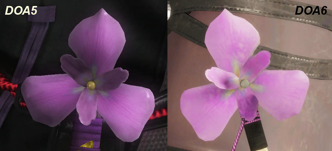
DOA6 Graphics Thread

Xhominid The Demon Within

Well-Known Member
Well looking through this thread and seeing this almost borderline maniacal fixation with details that most people won't notice unless you're a professional like Tyaren, that's exactly what it looks like. It's actually reached a point where it's enough to put someone off getting the game and if I didn't get to see the game at TGS myself, I'd be drinking from the punch bowl too. But because I DID play the game at TGS, I can say that it looked quite a bit better DOA5LR and wayyy better than Tekken 7, SC6 and SFV. I didn't have the luxury or even the patience to zoom in on every single strand of hair or fabric as you guys are doing now, but when I got back home and fired up 5, there was a quite a noticeable difference in the overall visual quality—even with the "flaws" that you've recently exposed.

I honestly have to agree with @nobi23 here. No offense to you @Tyaren or @Brute but while yes, DOA6 is not to the specifications of Ni-Oh for many reasons... it is stuff like this which does help make people believe DOA5 is somehow graphically superior to DOA6 of all things.

So he does have a point with you guys taking it TOO far in that area. It's fine to criticize... but let's not try and be like "These particles are not as detailed as these particles, THE FUCKING DEVELOPERS DIDN'T EVEN TRY!" type mindset as it breeds the very thing that we've been listening to the dumbasses who later on try and pretend DOA6 is too graphically similar to DOA5.
Not saying you guys ARE pushing into that direction, just that there are idiots who can and will take it that way.
 

Brute

Well-Known Member
Standard Donor
Not saying you guys ARE pushing into that direction, just that there are idiots who can and will take it that way.
Pandering to those "idiots" is not a priority of mine.

I can talk about certain less-than-stellar textures, or sub-standard poly counts, or whatever else, and sometimes I do, because I'm not the type to hold anything as sacrosanct or taboo (people who can't engage criticism are useless). But those things are not the primary focus of my vexation. I am not saying that I am unable to look past those elements to appreciate the good visuals that the game has to offer. What I am saying is that the game looks like someone is shining a goddamn flashlight into my eyes. I cannot fucking see clearly. Next to Fable's bloomrape, this is one of the most stupidly oppressive visual interferences I can recall from a non-indie game. It isn't merely a matter of "It could be better;" it's a matter of "Do they seriously have no idea how eyes work when they stare a lighted screen for hours on end?" It moves from "this doesn't look as good as it could" to "this literally (not figuratively) hurts to look at."

Some of the other graphical flaws and shortcomings do bother me to varying degrees, but I understand what it means to work on a budget. That said, a tight budget is not a free pass to produce whatever the hell. I'm aware that some people are going to say that the lighting doesn't bother them and that it's just a problem with me, but if you ask any educated artist or aesthete worth their salt about the state of this game's lighting and they'll tell you it's bad.
 

PhoenixVFIRE

Well-Known Member
230688518053212.png
i choked...
Are they confusing Rig with Prince Zuko? WTF was that?
god i wish, they'd be adding someone into the game who'd impress me you know what lets just scrap doa and make an atla/lok fg
This is a good comparison video of the old and new Nyotengu:


Wow, they completely messed up her facial expressions. She lost any sexappeal. Especially the last bit of the video directly comparing her lip lick animation is saddening. :(
that animation has Got to go... wtf... she lost any and all allure looking deadpan asf
 

Xhominid The Demon Within

Well-Known Member
Pandering to those "idiots" is not a priority of mine.

And while it shouldn't be, you still have those type of people being influenced by idiots and told otherwise through any means, including what you and @Tyaren are putting up here.
That's all I'm saying here, not like either of you two haven't been making that point, just that some will use it for their benefit in slinging the dumbest shit about DOA6.
 

Brute

Well-Known Member
Standard Donor
And while it shouldn't be, you still have those type of people being influenced by idiots
The type of people who are influenced by idiots are idiots themselves.

You're talking about people prone to sensationalism, and they'll run with whatever narrative they want, regardless what anyone says in this thread.
 

Macca Beam

Well-Known Member
on the bright side, i'm pretty confident the costume texture work in 6 (at least the new ones) are blowing 5's blurry, sometimes just a flat color """textures""" out of the water. it's the most noticeable when you accidentally hover over a costume ported from 5 and see all the horror unfold

it's the more rounder cuter face, her warmer/golden skin complexion
also you hit the nail on the head here. while the new face still has that superficial doll-like quality, the changes to the roundness (which is not only a result of making the outline rounder, but also the facial components smaller; most notably the mouth) and complexion are in line with some characteristics of youthful, attractive asian faces in real life. it could still use some cheek and vertical compression, but it's closer than the ambiguous slender jrpg heroine face from before.
ayane kind of did this before. it's kasumi's face with the above modifications and i always preferred it over the "base".
 
Last edited:

Tyaren

Well-Known Member
Standard Donor
on the bright side, i'm pretty confident the costume texture work in 6 (at least the new ones) are blowing 5's blurry, sometimes just a flat color """textures""" out of the water. it's the most noticeable when you accidentally hover over a costume ported from 5 and see all the horror unfold.

See, these are the unsubstantiated claims that make me respond to this thread, bringing out my in detail looks and comparisons. Then some complain about me being nitpicky and too negative. Unsubstantiated claims and completely subjective views are fine, fact stating and providing evidence is bad.

Back to the claim above:
How can one claim the texture work on characters is "blowing DOA5's out of the water" when you have new default costumes with this absolutely hideous texture work:

46756463701_e2ccc5ed96_o.png


45986058104_4b294b8e37_o.png


This is even worse than in DOA5, it is not nitpicky, it is a big, fat, glaring flaw and neither a small budget nor the weak consoles are at fault here. It is just lazy, shoddy work.
Honestly, the contrast of the jaggy, flat, low resolution hair to the beautifully modelled and textured face is insane!

Another comparison of Ayane's default costume texture detail that I just posted a couple of pages ago:

9by5rz2i2n4d842zg.jpg
 
Last edited:

Macca Beam

Well-Known Member
I assume these are supposed to have bad textures (lol, there is much worse...)? Okay, your claim was however the new DOA6 costumes' textures blow the old DOA5 ones out of the water, which isn't the case as I showed you. In fact, they are partly even worse in quality.
i'm sure there are worse but i didn't buy all $1000 of dlc
you seem to be wondering where were these textures i was talking about, there they are. i never said every single costume in 5 did it nor that the few costumes with effort put into them were worse than 6
 

Baji Breakdancer

Well-Known Member
Seeing that the extremely expensive Kingdom Hearts has the same "bad" pixely hair, it makes me think that it's a deliberate choice that makes hair look better in animation and just happens to look weird when you take a screenshot and zoom in.

Screenshot 2019-02-08 14.18.35.png


There is, after all, a proud tradition of good animation that looks weird when you dissect it.
 

Brute

Well-Known Member
Standard Donor
Kingdom Hearts was not aiming for a realistic art style. DOA clearly is, even if it's at times leaning towards idyllic-realism vs hyper-realism.

Putting my own biases aside, I wouldn't compare the two games visually. It would be like comparing skin textures in Overwatch to skin textures in the re-release of Resident Evil 2.
 

Tyaren

Well-Known Member
Standard Donor
Seeing that the extremely expensive Kingdom Hearts has the same "bad" pixely hair, it makes me think that it's a deliberate choice that makes hair look better in animation and just happens to look weird when you take a screenshot and zoom in.

View attachment 27641

There is, after all, a proud tradition of good animation that looks weird when you dissect it.

Yeah, no... Where do I begin to explain?

First of all, what you refer to as "bad and pixely" hair in the Kingdom Hearts 3 screenshot is aliasing. That's small jaggies that form along polygon edges. That happens in every game. It is especially visible in lower resolutions (1080p and lower) and when games fail to implement any or a good antialiasing solution.
Those jaggies you will hardly or not at all see in the PS4 Pro or Xbox One X version of KH3 (which are at an resolution of about 1440p.)

DOA6's "bad and pixely" hair looks "bad and pixely", because on top of lacking antialiasing (which Koei Tecmo games are sadly known for) the character model assets themselves are of bad quality, especially the really low resolution hair textures on some of the characters. If you look at Sora's hair in the game (not that badly compressed image you posted) you can see that the hair texture quality is actually great, all the models are of extreme polish, no comparison to the very inconsistent quality of DOA6 models.

DOA6's hair will in contrast to KH3 even look bad in super high resolutions and good antialiasing solutions on PC and Xbox One X. It will probably stand out even more in those high resolutions, because the image is so clean and clear.

That last part about hair deliberatly looking worse to look better in animation I really can't wrap my head around at all. @__@
 
Last edited:

Baji Breakdancer

Well-Known Member
Yes, I know what aliasing and anti-aliasing are, but my point is that you don’t notice either in-game unless you take a screenshot and zoom in really close.

The quality of graphics can’t be judged by zoomed in screenshots in a game, you have to look at how it moves. And there’s no one who’s watching video of Hayate going “that hair’s too jaggy.” So where’s the problem?
 

deathofaninja

Well-Known Member
Premium Donor
News Team
I highly doubt many will eventually complain about doa6 graphics (If played on 4K on PC for example), the only problem is the shiny skin textures(lighting)...

Yeah I think the lighting is my biggest gripe with the graphics thus far. Another minor gripe would be the water.

The water doesn't mesh naturally with the ground.
 

Tyaren

Well-Known Member
Standard Donor
The quality of graphics can’t be judged by zoomed in screenshots in a game, you have to look at how it moves. And there’s no one who’s watching video of Hayate going “that hair’s too jaggy.” So where’s the problem?

giphy.gif


Why are you going on about "pixely" and now "jaggy" hair. DOA6's problem are the low resolution textures, that's what I tried to explain to you.
And people sure did complain about DOA5 textures and they will complain about DOA6's partly worse textures.

It's also funny how we went from: "DOA6 textures blow DOA5's out of the water" to "Yeah, they are bad, but you won't even notice during movement and far zoomed out." The goal posts keep on moving and the standards keep on lowering. It'll be funny to see you guys bend over backwards to defend DOA7's even lower res textures (if the trend continues) on PS5, lol.

Last but not least, when it is all about movement and animation, can you now defend them messing up Nyotengu's animation and expressions?


That was a rhetorical question, by the way, I don't really want to hear it.
 
Last edited:

juliusxcix

Well-Known Member
giphy.gif


Why are you going on about "pixely" and now "jaggy" hair. DOA6's problem are the low resolution textures, that's what I tried to explain to you.
And people sure did complain about DOA5 textures and they will complain about DOA6's partly worse textures.

It's also funny how we went from: "DOA6 textures blow DOA5's out of the water" to "Yeah, they are bad, but you won't even notice during movement and far zoomed out." The goal posts keep on moving and the standards keep on lowering. It'll be funny to see you guys bend over backwards to defend DOA7's even lower res textures (if the trend continues) on PS5, lol.

Last but not least, when it is all about movement and animation, can you now defend them messing up Nyotengu's animation and expressions?


That was a rhetorical question, by the way, I don't really want to hear it.
i dont think they “messed up” her face. shes literally just clapped.
 
ALL DOA6 DOA5 DOA4 DOA3 DOA2U DOAD
Top