Argentus
Well-Known Member
On the other hand those hand wraps look badass lol.I would probably replace the strapped armlets with something else instead. It's kinda out of place with the bottom half looking so casual.
On the other hand those hand wraps look badass lol.I would probably replace the strapped armlets with something else instead. It's kinda out of place with the bottom half looking so casual.
I would probably replace the strapped armlets with something else instead. It's kinda out of place with the bottom half looking so casual.
i get what the jacky outfit was trying to accomplish and im not complaining. i just think there was some oversight on the designers behalf and maybe should've drawn a back reference, tho you would think TN would be smart enough to google an example?
jacky's shirt look more of a resemblance to

baggier and what not, the back should look like a hood. insteaddd...it....looks like............he tried on his little sisters shirt and see if it would fit and got caught in a fight with mila in the streets. im not complaining tho, the more abs the better. mila has a booty now. did anyone notice that? they enhanced her ass o.o
DoA 6 = Booty physics!
while im on the subject, i think the men should have chest physics. could you imagine the hilarity of their pectorals bouncing after a fight?

Well, that gif takes me back. And I can't help but think about Astaroth from Soulcalibur. Brosef was jiggling all over the place. lolYes! I'm not just saying that from a pervert perspective but from a serious perspective
When you fight someone your skin undulates everywhere especially the pecs, thighs and buttocks (especially thighs). This would work well. EA sports UFC incorporates it well. It would be a move that guys wouldnt notice but the ladies and non-straight guys? lol would notice.
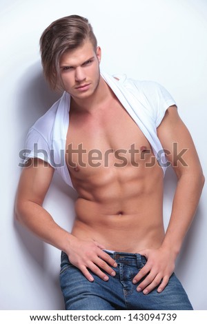
Also: @ the model in the photo

For real though. That guys hawt. Thank you @Boogie
A fellow will and grace watcher!? YES!!!! *hug*Well, that gif takes me back. And I can't help but think about Astaroth from Soulcalibur. Brosef was jiggling all over the place. lol
Voldo and X were the King and Queen of the butt jiggle in SC2 lol.Well, that gif takes me back. And I can't help but think about Astaroth from Soulcalibur. Brosef was jiggling all over the place. lol
I think its a matter of perspective.Jacky's outfit is funny, because I do know guys do have a tendency to pull their shirt back over their heads without taking it all the way off. Of course it looks ridiculous, but some men do this. However, in game, the costume looks...stupid to me. To be perfectly honest, I think I prefer Jacky's costume where he's wearing a wife beater and has his jacket tied on his waste. Much more tasteful and sexier.
I think I would have preferred if the outfit had no shirt and tbh, I think Team Ninja should give us that option.I think its a matter of perspective.
Much like how the bikinis make no sense in the arctic, I think jacky's shirt tuck would make more sense on the beach or desert stage.
Seriously though this outfit woulda been badass without the rollback shirt. no offense to the designer.
On the other hand those hand wraps look badass lol.
Yes, probably some bulky gloves, matching the bulky boots. The outfit would look much more coherent that way.
super lame default costumes
No on the cow overalls.
the skull top and camo skirt should've been the default. That would've made a more decent first impression.
Anyhoo, I'm rolling at people calling Jacky a gay hooker, though. Lollerskates for days. Thanks @Kronin for providing us with what Jacky's "shirt" is because I really had no idea. The in-game design does come off as odd straight away, but knowing what TN was going for helps.
Personally I find these vids revealing 2 fan outfits at a time to be overkill and unnecessary. I think one vid showing brief scenes of all of them would have been better. I get that they're trying to build suspense for which fan design was chosen next but nothing else they show in the vid is new so...
No on the cow overalls. But, the skull top and camo skirt should've been the default. That would've made a more decent first impression.
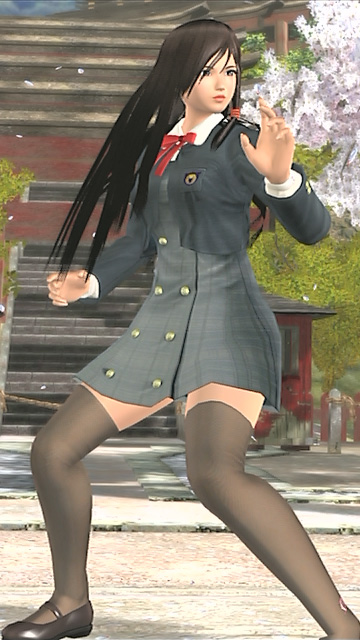
I'm fine with the school uniform as her default. Namely cause it's not like this uniform in particular has been worn by any of the characters yet. So it is probably over-done ( the schoolgirl thing ) but this uniform in particular, is different from the rest....
Of course remember that is just a theory of mine to associate the in-game design with that article against the muscular pains: to me seems just so but I can't say to have the certainty. EDIT : The correct term in English should be "thermal shoulder brace", thanks to the user Ronnie Hill from Facebook.
Surely the original designer wished to create the effect of the skirt pulled over the head as Boogie showned us in that photo, but the problems with the design (that wasn't clear in giving this idea, this time TN has no faults) made hard to realize it for the developers.
If you look at the original entry it says in big clear letters "Red tshirt pulled over his head". TN either didn't understand or were too lazy. Either way I don't care. I think it looks freaking badass. Makes me actually wanna pick up Jacky and learn to fight as him. I'm a huge fan of the design


Not really different to be honest... Bottom half of Salad's schoolgirl uniform looks similar to Kokoro's C4 especially the skirt, knee-high socks and loafers while the version without the without the school jacket looks similar to Kokoro's uniform from DOA4/Dimensions.


I know, but to me that design give really the exact idea of what we saw in the trailer yesterday. The drawned shirts needed to be much more clear about the borrows around the neck (blue circle) and the lenght to to the sides (red circle) as happens in the photo.


Otherwise can really give the idea, at least for me, to be a mini shirt covering only the shrugs of Jacky as in the model in-game (but I admit to not have ever seen before yesterday similar pictures of people using shirts pulled over the head, so my judgement could be baised).
